On distraction-free reading experiences
UX Lausanne is the first event in Western Switzerland dedicated to user experience design. Adrian Zumbrunnen (IA/UX/UI Designer) presented “On Distraction-Free Reading Experiences.” Adrian Zumbrunnen’s distraction-free approach means suppressing all sources of distraction from our reading interfaces. We may have to think more deeply about our design process, and put content and readers again at the center of our concerns.
Adrian Zumbrunnen – Photo Guillaume Coquoz
With the rise of digital reading devices, readers are overwhelmed with information. These devices can display increasingly dynamic content in the reader’s field of vision. This massive content, however, also hinders the reader’s concentration when it is too visible or poorly laid out. The designer’s role is thus to bring clarity to the reading interfaces of websites, blogs and online articles. Let’s return to the key points that Adrian Zumbrunnen developed, and help the reader with the best possible experience.
In 2013, mobile devices represented about 20 percent of web traffic, and it keeps rising. Thus the best experience must be offered on mobile devices. On many websites, position fixed (headers, menus) take up too much space. The main content is then amputated by many pixels, which is detrimental to the reader’s experience especially on mobiles with small screens. When scrolling down the page, Adrian recommends using a simple menu button, which is less in-your-face than a header remaining at the top of the screen.

Adrian also emphasized the alignment of a website’s various elements: images embedded in the body of the article must always be justified to the right, or inserted between two paragraphs so as not to interrupt the reading flow from left to right.
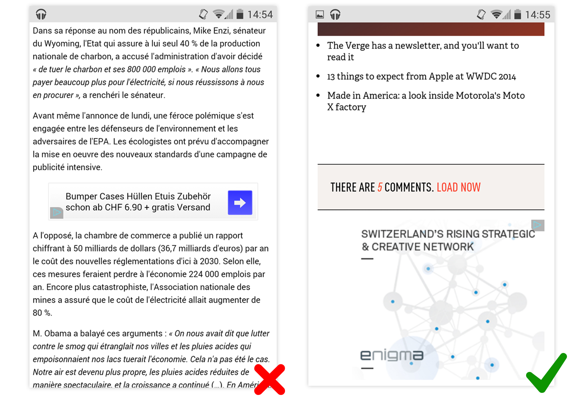
Those non-textual elements, and especially advertising banners, should be integrated at the end of the article content. Although they are essential in a free model by bringing income to publishers, we do not surf the web to see advertising.

The most debated argument in Adrian’s talk was the use of sidebars. Let’s summarize in these terms:
Sidebars distract the reader’s attention. They are very popular, especially on blogs and CMS platforms; it is hard to imagine they could be an UX mistake. According to Adrian, however, we should also learn to do without them.