Responsive web design
The web is a playground that is constantly renewing itself. Technology evolves at an incredible pace and websites become more efficient, complex and effective. Le latest media buzz related to HTML5, which integrates audio and video without plug-ins, as easily as images.
The next big thing on the web is Responsive web design. This opportunity is not to be missed, as it will totally revolutionize web design and the way that people will browse the Internet. Here are tips to create your next website:
Screen resolution has always been a challenge for the web. Years ago, one could read “website optimized for an 800 x 600 screen.” The standard later expanded along with the screen size, first to 1024px, then to 1280px. But while some screens increase in size, smartphones and tablets come in lower resolution, such as 320px width for the iPhone (before the high-resolution Retina screen for the iPhone 4).
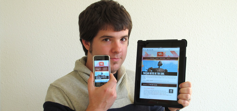
Let’s take an example. Someone can have a 24” screen at work, a 13” laptop at home, an iPad to browse on the couch and an iPhone for the road. Four devices of radically different sizes, but also with different navigation modes: a mouse on the computer, fingers on the tablet and the smartphone.

One cannot speak about a standard size anymore, since there is no more standard. Neither is creating a website tailored to each device a viable option.
Flexible designs that adapt to the browser’s window size are not new; in fact, they have been around for a very long time. They perfectly match a 15” or 17” screen, but they have a harder time adjusting to iPhones; they have readability issues on 27”-wide screens. This is when the concept of “responsive web design” becomes handy:
With Media Queries CSS, one can define new display parameters according to window size. In other words, one applies new rules that adapt to the screen size: big images and wide pages for large monitors, and an adjusted format for smaller devices. No need to create special versions—it is the same base and content.
Rather than complicated words, here is a video example found on the website specially created by as an example for his book Responsive Web Design.
It is that easy!
It is indeed a simple but efficient process that uses web standards. No plug-ins, no extensions. The website will be optimally displayed on all devices.
Let’s take another example
- On a very large screen: content spread on two columns and a very wide page
- On a smaller screen: one column only and a narrower website
- On a tablet: design adapted to tactile navigation
- On mobile devices: a narrow display and tactile navigation
This approach is especially relevant for Android phones. While Apple’s iPhones offer a uniform resolution, Android phones are all different; it is impossible to foresee specific sizes foe each device. Responsive design, as its name shows, adapts best to each different size. The Android user will not be frustrated when browsing a website that is configured for iPhones only; rather, websites will be compatible with all available smartphones.
Since responsive design uses standard web technologies, it is compatible with a wide range of devices—smartphones and tablets (iOS, Android, etc.) as well as computers (Windows, Mac OS, Linux). Unfortunately, Microsoft’s Internet Explorer doesn’t support such technology prior to its version 9. This means that the websites will be compatible with older versions, but that they will not adapt as easily to each screen size.
Let’s use some images to understand the concept. I am using screen shots from the excellent website that displays a gallery of the best responsive websites currently available. You should also check out these websites and reformat your browser’s window to see the result.
On , the background video adapts as easily to the window size as a regular image. It disappears in smaller formats to avoid long loading times.
makes perfect use of responsive design by making its design as readable and pleasant as possible. The slider at the top of the page is perfect, even on a mobile format.
Responsive design helps make its navigation easier; the menu displays on the side for large screen size and horizontally at the top for small formats. They even dare to get rid of navigation icons on the mobile format, so that users don’t lose any precious pixels vertically on smartphones.
Check out other websites on .
This is the future of web design: a website that adapts to all devices, regardless of their operating system, and regardless of their resolution.