
Dark patterns: what are they & how to protect yourself
User experience is all about making life easier for everyone who visits your website to start your relationship in the most enjoyable way for everyone. In an ideal world, creating the perfect user experience would be the priority of every business. However, some companies resort to questionable practices to entice users to do something they may not want to do. People end up checking the wrong box or paying extra fees without realizing it, because these companies know how to get them to do what’s best for their business, at the expense of users.
Lying is never good. That’s why we want to highlight these practices called dark patterns (also known as deceptive design patterns) and help you identify them to protect yourself from deceptive digital experiences. What exactly are they? How do you spot them? How do they affect consumers and their perception of marketing? Well, you’ll discover the answer to these questions in this article.
Harry Brignull and the fight against dark patterns
According to Harry Brignull, the UX specialist at the origin of the fight against dark patterns, such deceptive practices can be defined as “features designed to entice users to do things they may not be willing to do, but which benefit the company in question.” You can come across dark patterns on an app or a website and fall into the trap without being aware of it. Because people don’t pay full attention to every single word they read online, they can easily be led to tick the wrong box or subscribe to an email list they wouldn’t want to be a part of.
Harry Brignull was the first to raise awareness around dark patterns and has been campaigning against them since 2010. On his website, you can find hundreds of examples in the “Hall of Shame” which puts companies that use such deceptive patterns under the spotlight.
Let’s have a closer look at the 12 types of deceptive design patterns that have been identified out there.
1. Trick questions
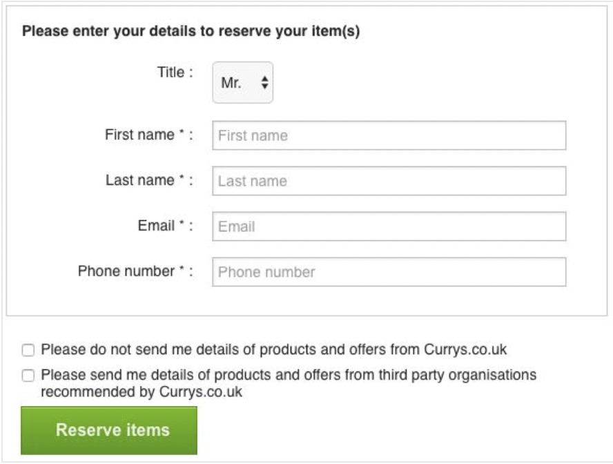
Imagine filling in a form on a website. You read the questions once and understand something, but when you look more closely, you realize it actually asks for something else and you’ve given an answer you didn’t mean to give. For example, responding positively to a negatively worded action creates a cognitive dissonance that may confuse the user enough to subscribe to an action that they would not normally have subscribed to if it had been worded correctly.
2. Sneak into basket
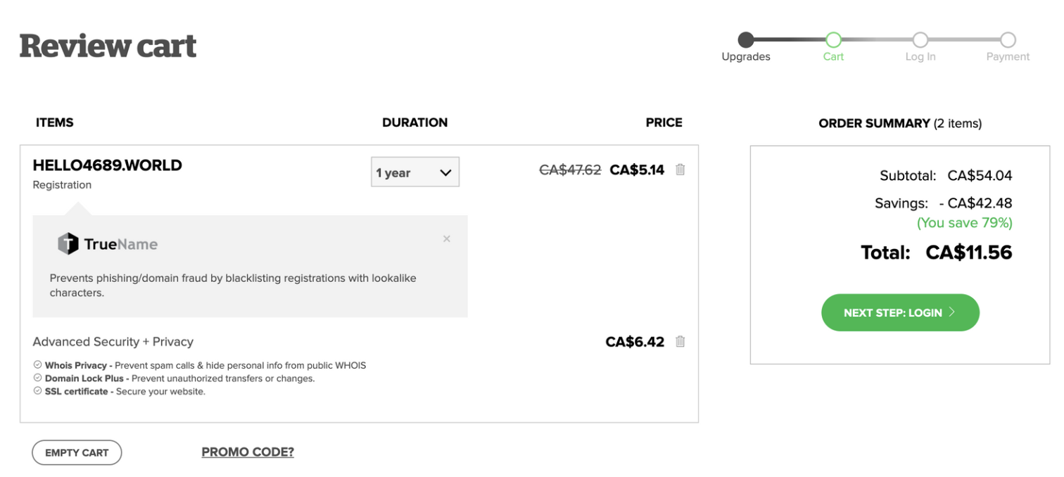
You probably experienced the sneak-into-basket technique more than once while attempting to make an online purchase. Originally, your objective might be to buy a piece of furniture or a ticket to a live concert, but if you pay attention to the detailed basket, you will see that insurance and delivery fees have been added without asking for your consent.
In the past, GoDaddy, the internet hosting company, would automatically add unsolicited privacy to a domain.
3. Roach motel
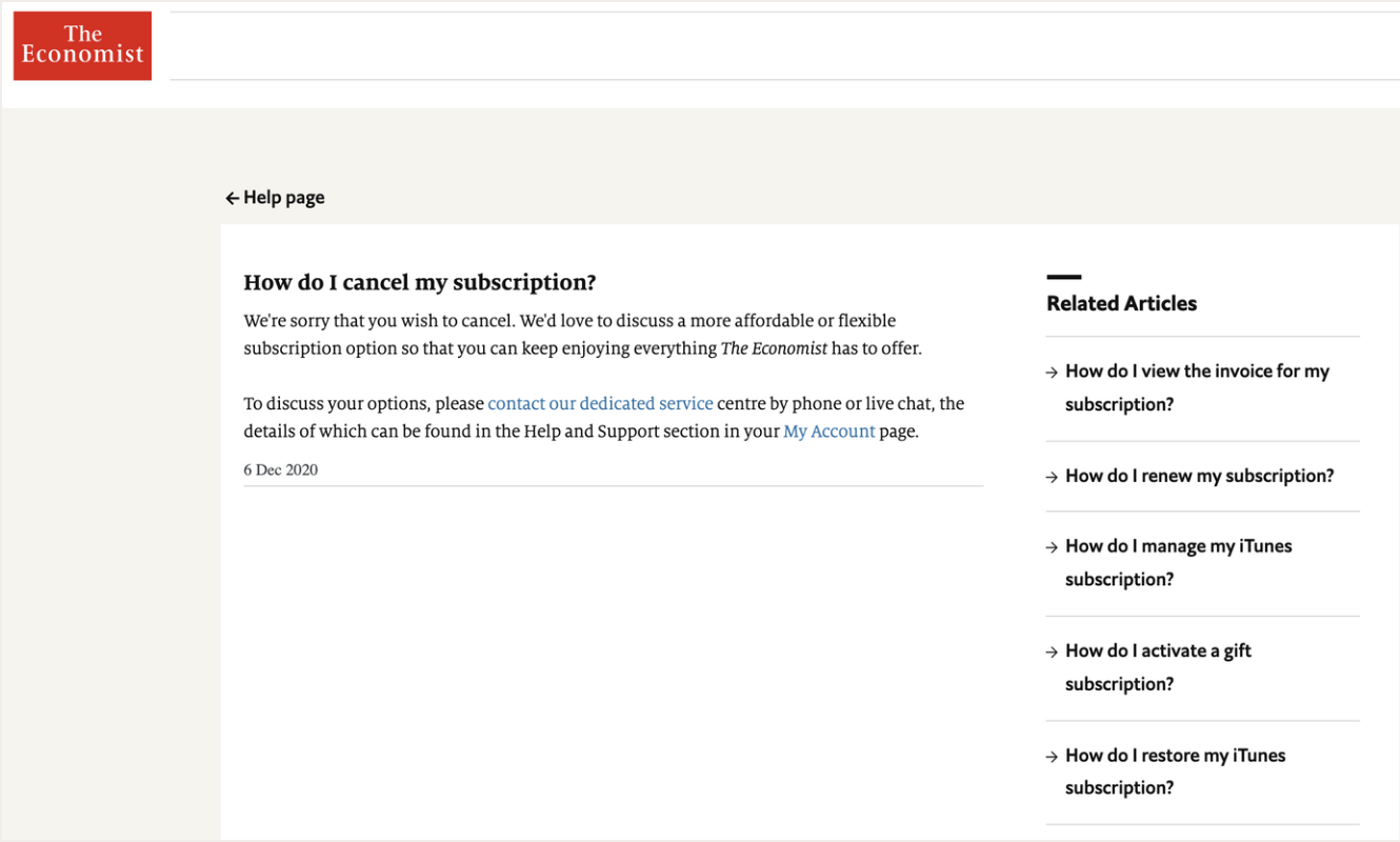
The Economist is a good student when it comes to roach motel practices – and other dark patterns. Think of the song Hotel California by the Eagles: it’s easy to get into it, but once you’re in, you can never leave. That’s what The Economist does to subscribers as it is extremely complicated to delete your subscription. You literally cannot do it yourself, you need to ask them to delete it for you.
4. Privacy zuckering
Mark Zuckerberg inspired Harry Brignull as this practice has been named after Facebook founder and CEO. Privacy zuckering is a tactic that tricks you into sharing more personal information than you intended to. It often uses complex and confusing terms and conditions and privacy policies enticing the users to hand over their personal information to various data brokerage companies, without knowing about it.
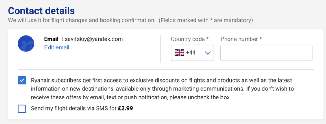
Signing you up for promotion materials is also considered like privacy zuckering. The example of Ryanair illustrates this practice.
5. Price comparison prevention
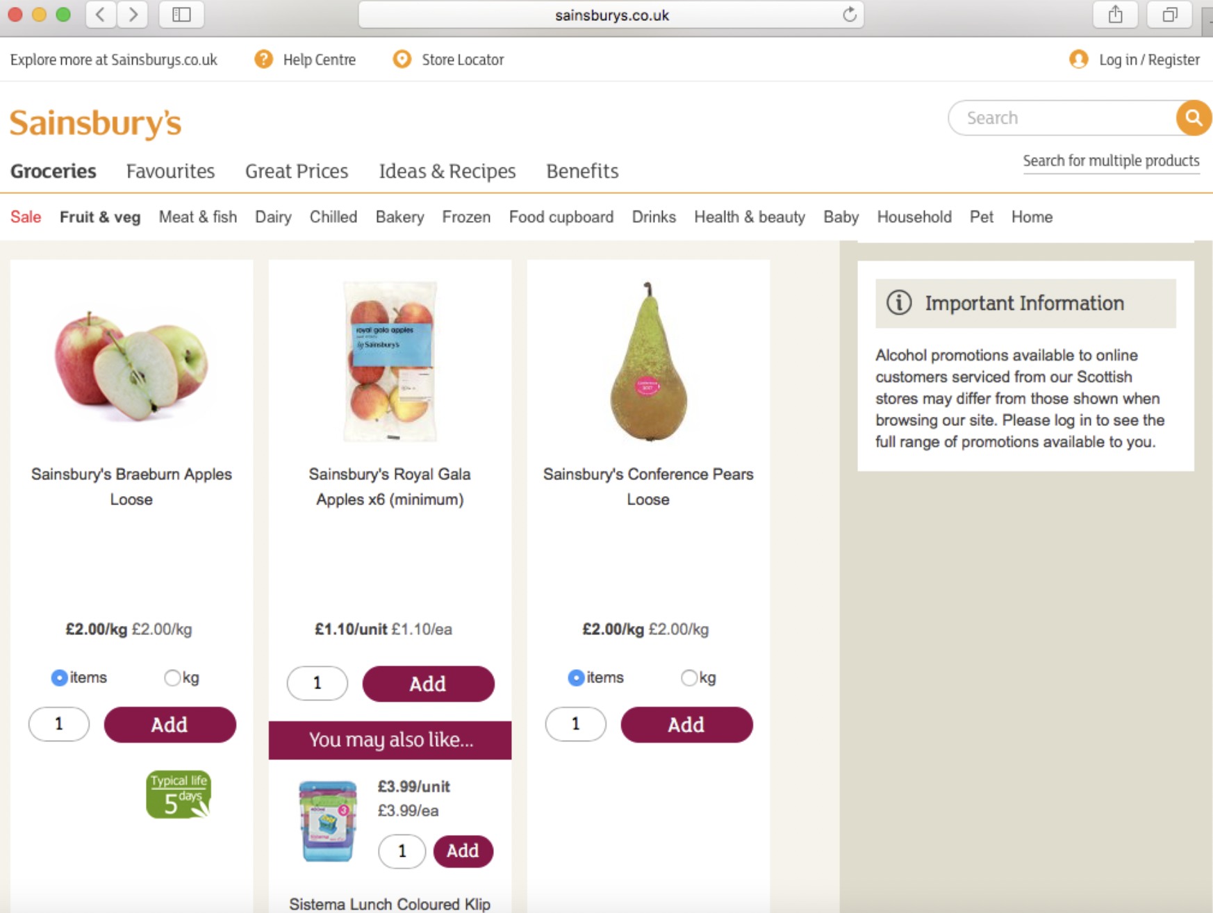
To prevent you from comparing the price of a package and per unit, retailers consciously blur the information so it is hard for you to take a decision. The most common behavior would then be to buy the package, resulting in a higher cost compared to the price per unit.
6. Misdirection
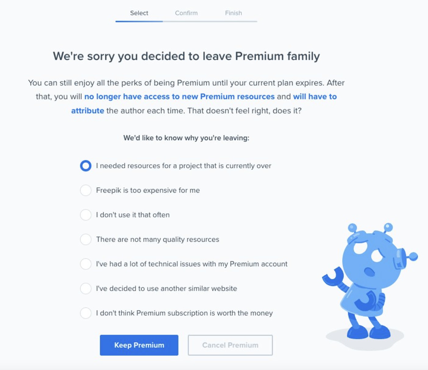
We talk about misdirection when the web design intentionally places the focus on one thing to distract you from another. For instance, when trying to cancel a Freepic subscription, the focus is intentionally placed on the button “Keep Premium”.
7. Hidden costs
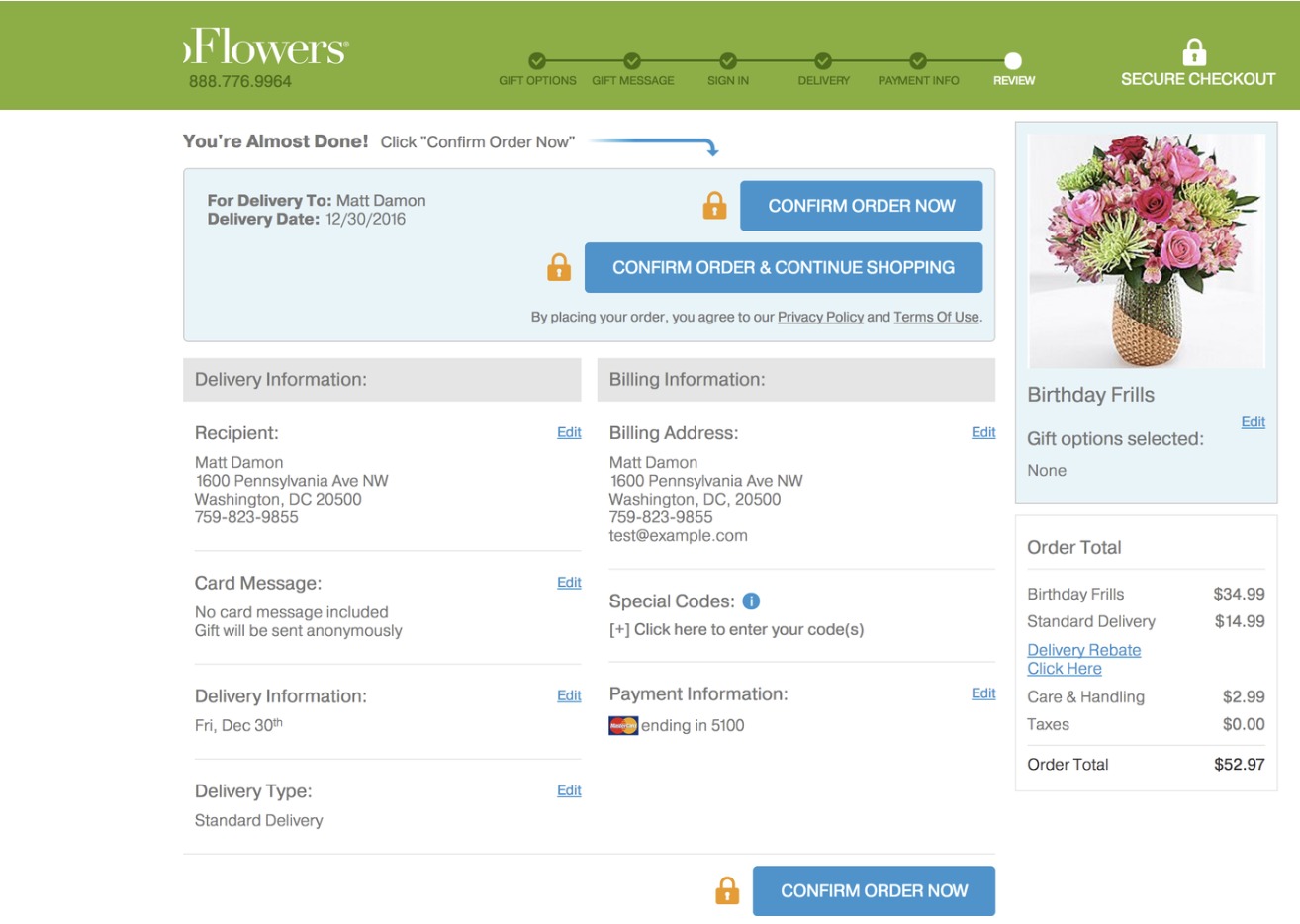
All your items are in the basket, and you’re ready to pay. Suddenly, you notice the total amount doesn’t correspond to the price you’ve seen previously and new fees have appeared, often related to insurance or delivery. In the illustration below, delivery and care & handling fees only appear in the last step.
8. Bait and switch
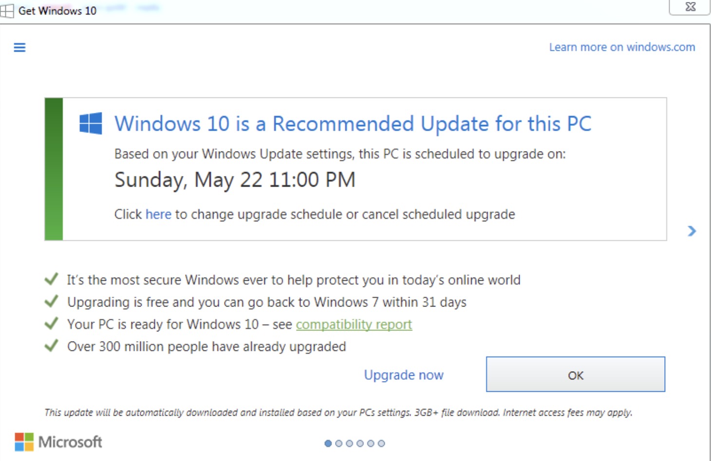
Your screen shows two explicit options but when you click on the one you want, it’s the other one that is triggered. Microsoft 10 undesirable upgrade is a famous example of this dark pattern. Closing the popup resulted in launching the upgrade instead… and users have made themselves heard.
9. Confirmshaming
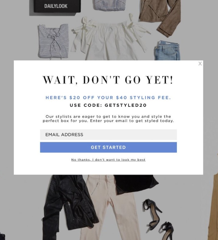
Guilt is a powerful emotion and confirmshaming certainly knows how to use it. If the user declines an offer, it is shamed in order to make them change their mind. A button such as “No, I don’t want to receive amazing content” on a newsletter pop-up is a good example.
10. Disguised ads
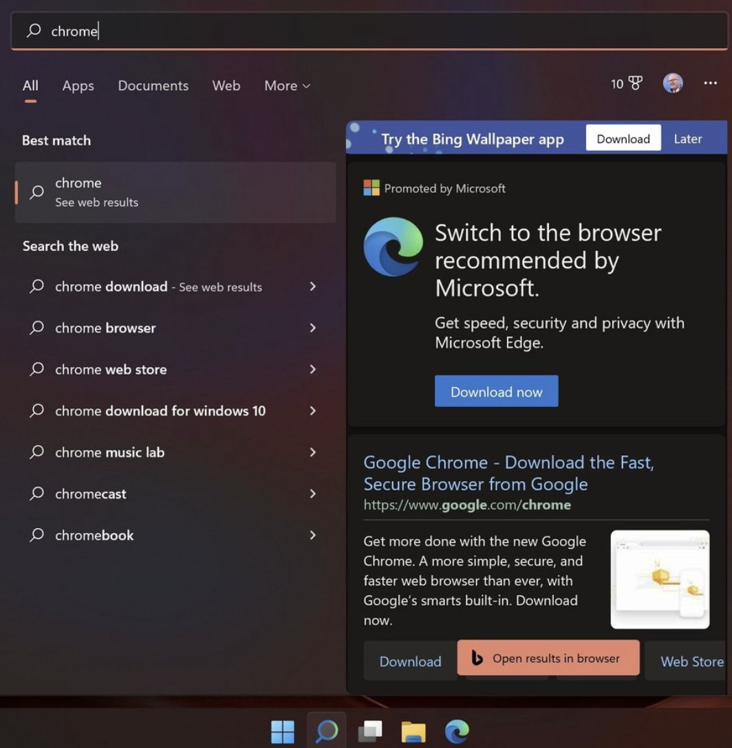
Have you ever clicked on a download button being certain it wasn’t an ad? Well, you’re not the only one. The name of this practice is pretty explicit: ads that are disguised into other kinds of content to trick you into clicking on them. For example, if you search for Google Chrome on Microsoft’s Windows 11, you won’t find what you were looking for. Instead, they will present you with a Microsoft Edge advertisement with a download CTA.
11. Forced continuity
Most of us have had bad experiences with gym memberships forcing us to pay because we missed the split-second window to unsubscribe from the service. Forced continuity dark pattern is the same, but online, and it can happen with pretty much any kind of service.
12. Friend spam
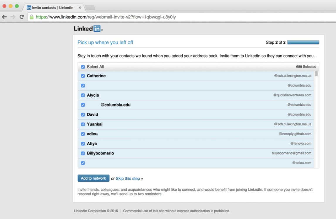
LinkedIn made a pretty big scandal using this dark pattern and ended up paying a 13-million fine in 2015. The trick they used was to entice users to agree to give access to their contacts by claiming that they will be used to provide great networking opportunities. Instead, the platform used them to spam all of their contacts.
Why is the fight against dark patterns important?
Trust is the foundation of every healthy relationship. It takes a huge amount of time to regain your clients’ confidence when you lose it, so why not be honest from the start?
Additionally, the way some companies handle their marketing activities negatively affects the entire sector of marketing. They are the reason why some people think of marketing as a set of unethical, manipulative activities. And it is true when sneaky marketers make use of dark patterns at the expense of their users. However, fortunately, there are still honest individuals out there, willing to make money in a way that actually benefits all.
It’s all a matter of perspective: if marketers use psychology to the detriment of others, they are deceitful and manipulative. If they use it to better understand the needs of their customers and how to add value to their life through their products and services, they are smart and helpful. We chose to be smart and helpful and to raise awareness against practices that are not.