Should digital design imitate reality?
The phenomenon is called digital skeuomorphism. The buttons for iPhone apps are one of the most common examples. If you take a close look, you’ll see that they look like keyboard keys. Same round corners, same proportions, and same shadows on the side to give a volume effect.
Apple uses design as a means to distinguish itself from its competition. One of the strengths of the first iPhone was the touch screen and the end of buttons. So why would Apple somehow regress by including a menu that looks like a good old keyboard?
Digital skeuomorphism is everywhere and we are already used to it. Save buttons are indicated by a floppy disk. This hardware only exists on geeks’ t-shirts at this point, but the symbol has been adopted. Same with email: it is symbolized by an envelope, an object that is technically very far from email and that was even replaced by it. That’s the goal of skeuomorphism: to make a concept more accessible by adopting the appearance of a known object that has a similar purpose. This technique is a didactic means to explain how things operate. It allows for more intuition in an interface by imitating a known object.
However, not all attempts to make life easier are successful. The PageFlip system, which helps show a PDF file as a book whose pages can be flipped, is an ergonomic aberration. For American sociologist Ted Nelson, “Imitating paper on a computer screen is like tearing the wings off a 747 and using it as a bus on the highway.”
The downside of skeuomorphism is that the graphic base eats up the ergonomic aspect. It is easier to update a Facebook newsfeed by scrolling down rather than by clicking on a button designed as an ice cube to “refresh” the page.
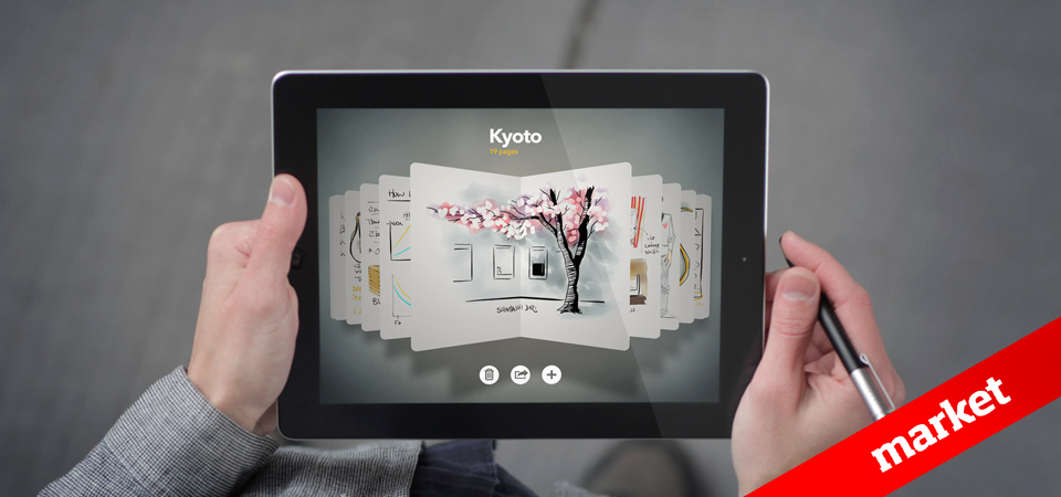
If so, why do we see numerous interfaces that look like familiar objects? The EasyJet website is full of stickers that visitors are encouraged to peel off “to learn more”. As if clicking was equivalent to peeling off the label of a Coca-Cola bottle to learn the details of a new contest. Apple’s online bookstore is a wooden bookcase in which books are neatly arranged on shelves and show their 3D back and title. The interface of the “Notes” software for iPad goes even further, and adds a stitched leather frame, and the effect of a torn paper sheet just like a real notepad.
The advantage of skeuomorphism is obvious: it explains and encourages the adoption of new behaviors to the consumers who are the most resistant to change: the “late majority” and the “laggards.” In the graph showing the adoption of a product, “innovators” and “trend setters” are ready to explore new practices, while “laggards” and the “late majority” want to make sure that a novelty will endure, even if many users have adopted it immediately. Apple, for example, cannot afford to wait for the last target markets to buy a tablet. Their strategy is thus to compare the new product to familiar and useful objects: the notepad, the bookcase, etc.
Aesthetics
One of the problems with skeuomorphism is that form supersedes content. It is difficult to promote a beautiful product in a vintage environment. It is better to work on the user experience even if it’s more complex. This is what geniuses do: they invent usages that are technology-specific.
The imitation of the physical world is the result of a strategy to conquer the last markets that have not adopted digital practices. The most astounding is to see this trend emerge on the Internet or in software that doesn’t need it, or even that is cluttered by it. How many technophile-oriented websites or those that present new product have used this strategy without understanding its purpose? Imitating a behavior is not a strategy. One must imitate the creative process of a strategy in order to hope for results. Imitating Apple’s current practice is a mistake.
Skeuomorphism is a natural step in the process that leads to adopting new media. Some details will endure, while the largest part will disappear, just like the first cars that looked like carriages.