
Logos you must never choose
If you are in a position to choose a logo, here are some professional logotypes and common mistakes in logo design that you should definitely keep your hands off.
(Read also: All about Branding)
OMG, you are so trendy!
This is something that nobody should never say about your newly designed logo. Following trends might seem like a smart choice initially. But as we all know and have experienced, trends are about as short-lived as goldfish’s memories. So as in as you might be at the very moment your logo is introduced, as out you will most likely be in a very short time. Your logo design should be timeless and authentic. It should represent your business and the product or service you offer, not the current trend.
Some of the best logos that were ever designed stand out exactly because of that fact. Over the years, they have been slightly adapted. But in their essence, they are timeless.
Design is as little design as possible
Also in the domain of logo design, you should always have the mantra “Simplicity is key” in the back of your mind. Because it really is. Especially in a time of ultimate adaptability where your logo does not only have to work on billboards and ads, but also on social media, websites and phone screens, it is crucial to keep it simple.
→ Read our detailed article about responsive logos
The same is true for the number of fonts and colors chosen. Never use more than three colors in your logo, and try to limit yourself (or your designer) to a maximum of two font types. Ideally, your logo should also work completely without colors and not come across as boring in case it is displayed somewhere in black and white.
The only area where complexity is desired is in the resolution of your graphic. Ensure that your are using vector instead of raster graphics so that the quality of your logo stays the same in every format.
Panta Rheï
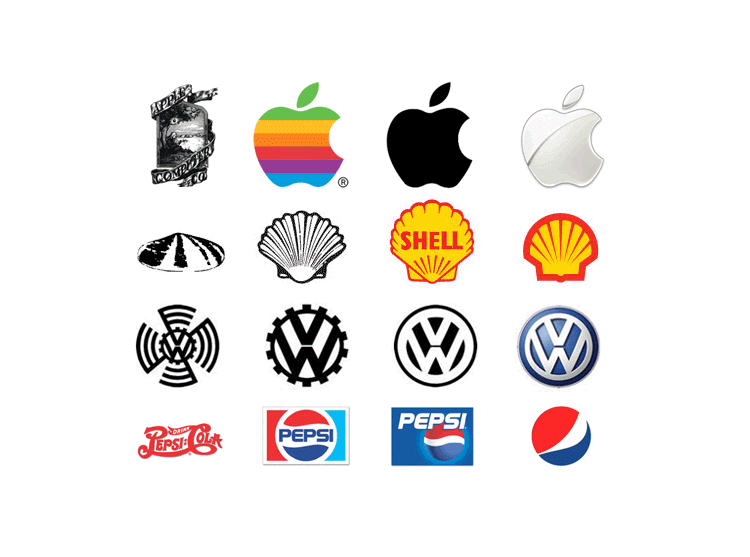
Ancient Greeks used this saying to remember that everything is in constant flux. So, just as your business, your product and the whole entire world around you are evolving, why should your logo stay the same? Of course it’s important not to lose your corporate identity, but you still need to constantly adapt your logo to changing times and the requirements they bring.
Stagnation is deadly and therefore, keeping an eye on what is happening around you as well as with your business is vital.
For inspiration, look at the logo evolution of the following brands throughout the years:
LG, LV and IBM
Yes, acronyms might work. When you are huge. And immensely well-known. But if you are only just starting out, monograms using your acronym or abbreviation of your company’s name might just cause unnecessary confusion. You can still shorten your name once you made it and people know who the hell they are talking about.
Same same, but different
Recently, a new trend in logo design has emerged that has been labelled by critics (rightfully so!) as “blanding”. It encompasses a generation of new branding patterns that eliminate any kind of uniqueness from their corporate identity and standardize everything in order to please a larger target group.
Do you know at least one start-up logo that shows a made-up word in standard sans-serif font, brightly colored, on a white background? Then you know essentially what blanding entails.
But why do new businesses partake in this utterly boring way of defining themselves? One reason is because they try to be something they might not yet be. A lot of tech giants have slowly over the years simplified their logo to a design as previously described. However, there is one big difference: These brands have already proven themselves. They ARE their product. Thus, they remain recognizable, even with a simple logo design.
Logically, start-up brands will try to be like that to convey something they are not: entirely confident about the product they are selling. Even though they might not even know how good or safe it is at this point in time either. Problem: Blanding makes you one amongst a thousand. And boring.
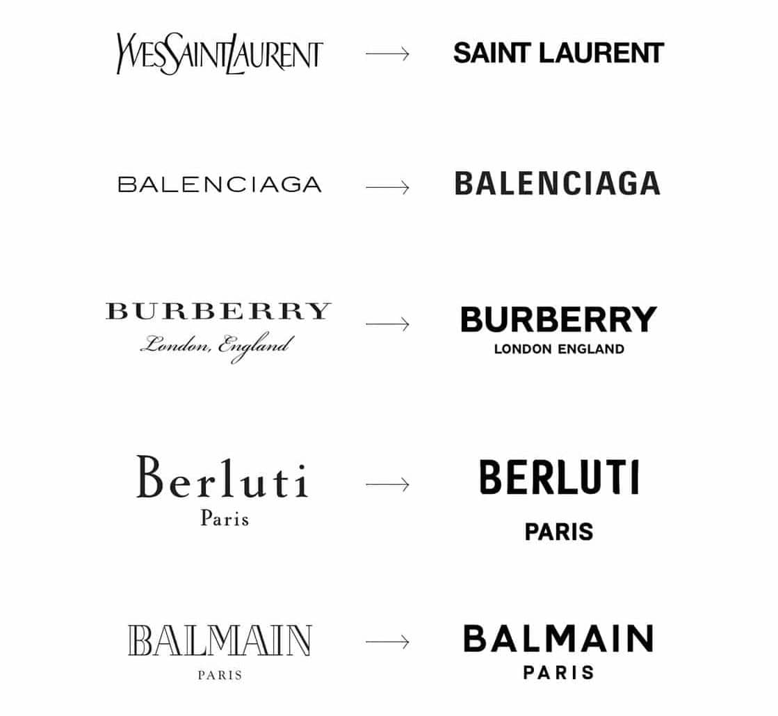
Another reason why businesses engage in blanding might be out of fear to display their uniqueness, to step out of their comfort zone. After all, it is easier to go with the flow than to swim against it. And if you try anyways, you will have to deal with critics, or even haters. So better not bother.
Lastly, there’s a technical reason to go for blanding. As previously mentioned, the safe bet for a lazy designer to make sure their design will be readable on various platforms in the age of omnichannel branding.
“Descriptive” logos
A brand name should not be too descriptive because of the many legal limits on the appropriation of common names. For example, a knife brand that registers the name “Slice” will not be approved. While there are restrictions on the name of a brand, the same cannot be said for the creation of a logo.
“Descriptive” logos can be interesting, but they unconsciously define themselves to the consumer as a low cost brand. Here are a few examples:

These brands are well known and have a good reputation. For them, the “descriptive” logo works very well. They are designed to be in supermarkets, to be on the shelf and to catch the eye of the customer. They have to describe the product. They are “pleonasmic brands”.
You may be familiar with the “WHY, HOW, WHAT” method, defined by Simon Sinek. A brand must emphasise its WHY – the purpose of the brand. “Pleonasmic” brands emphasise the WHAT-products or services they offer, but this does not add much value to you and your consumer.
Brand evolution
Take the adidas brand for example. Its first two logos were composed of sports shoes. From 1950 onwards, the trainer disappeared to make way for a more streamlined logo imposing its name.
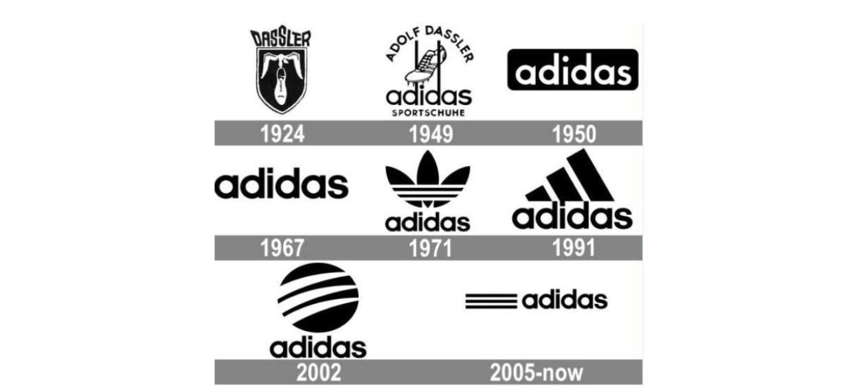
Or Chupa Chups, which in another way has also abandoned its descriptive logo created in 1978:
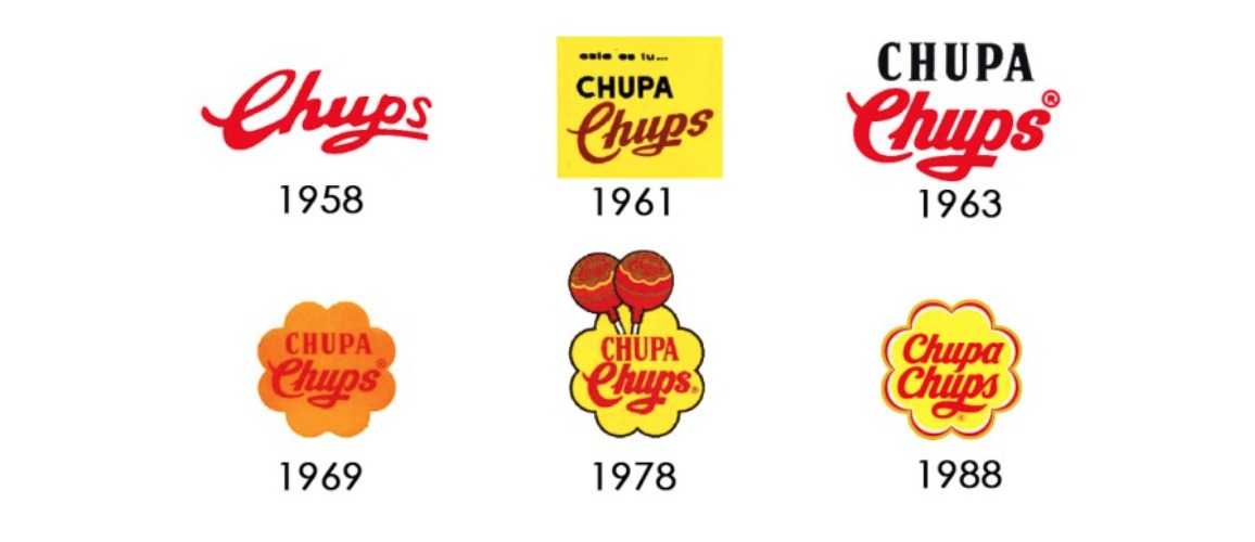
You will find that there are very few descriptive logos in today’s efficient brands.
The reason is simple. Instead of discovering brands mainly in supermarkets, we discover brands on the web and especially on social networks.
So when you design your logo, think about that. If you want to be low cost and be picked off a shelf, be pleonasmic. If you don’t want to be low-cost, then go your way.
After this intimidating rant on everything you should NOT do when designing a new logo or choosing a new logo design, you should be prepared to face the struggle that is finding your own unique logo. To find out how to visualize, what makes you, your business, and your product special. And not like everyone else. Take the free test now!