
Digital branding: It’s Time for Responsive Logos
Have you heard of responsive logos? It’s the latest step in a general trend for corporate identity to get fit for today. In a world where screens come in all sizes AND shapes, adapting content cannot just mean scaling up or down. Instead, we need logos that can make an elegant and efficient use of any screen space.
Many designers have been feeling that we need a new approach to logo design. UK-based Joe Harrison published quite an interesting experiment. Taking existing famous brands he imagined how these universal logos could adapt to various screens. The results show logos that are increasingly simpler for smaller screens whereas they get more details for larger screens.
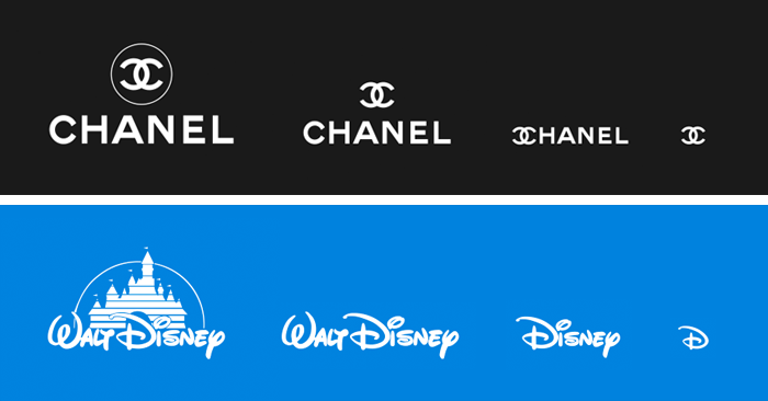
‘Responsive logos’ is a project that explores how brands might adapt for todays multiple devices and screen resolutions. By applying responsive design principles to individual elements of a logo, and stripping out detail in relation to screen size, a more legible and appropriate logo can be displayed. The concept aims to move branding away from fixed, rigid guidelines into a more flexible and contextual system.
– Joe Harrison
Caution: logo freedom ahead
What’s remarkable in this work is not the designs themselves but the new mindset Harrison calls for. For decades now, corporate identity has been seen as a sacred cow. Based on the idea that a brand has to be recognized from TV ad to the supermarket, a logo is not to be touched, adapted or tampered with. It doesn’t make any sense now, if it ever did.
When you think of a brand such as Adidas, you probably picture its logo. But are you thinking of its entire logo, the famous three stripes with the word adidas in Avant Garde Gothic underneath? Just the stripes? Perhaps just the name? Or is it the original trefoil logo?
The truth is that you could flash any of them to any brand-aware person and they’d instantly recognise it as belonging to Adidas. And you could say the same about most logos.
– Charlie Hankers
So, Harrison’s work shows logos that look different at every stage. They use more or fewer elements, and those elements can be organized in various ways to match the environment. Of course, we still identify all these brands without a doubt.
Read more about the differentiating value of logos here
Responsive logos for Superhero brands
While some old-fashioned branding practitioners might shake their heads at this approach, we’re convinced it works pretty well.
The historically sacred view that a company’s logo is a rigid form that must never change is giving way to a new kind of branding freedom, where logos respond and vary.
– Jon Tarr
To those, we’d like to say: yes, there was a time where a logo was the familiar sight that helped you recognize a product from a TV ad to the supermarket shelf. But not anymore.
As we explain in our Superhero Branding approach, modern brands are mimicking human behaviors. Just like humans, they don’t look exactly the same every day. They’re not afraid to evolve, or to adapt to the context.
And here’s the secret sauce: since they have a real personality, these brands are not stuck to a rigid visual appearance. Today, the best brands are part of our lives. And we know them so well, we don’t really need a logo to identify them. A sound, a shape, a tone of voice are usually enough.
How are responsive logos created?
Joe Harrison’s work basically uses more or fewer elements as the screen space gets larger or smaller. And it works quite well. But of course, we could go a little further than that.
Perhaps when designing logos for the responsive age we should try and bear the following in mind:
1. A logo is not a brand
2. A brand is not a logo
3. A logo is the same as other elements of the identity system, such as colour, slogans, and emblems.
4. Logos should be simple and clear memory hooks. Nothing more, nothing less.
Once we accept this the logo can start to respond responsively.
At last.
– Charlie Hankers
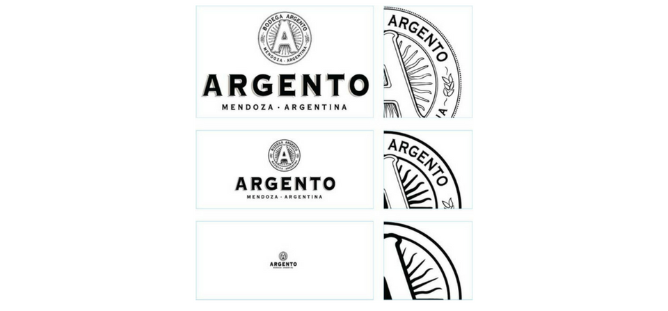
Let’s take a look at Argento, an Argentinian vineyards brand. While they take out some details for smaller screens, they also redesign some details that are kept. This way, these details can be displayed in an elegant and legible manner even on smaller screens.
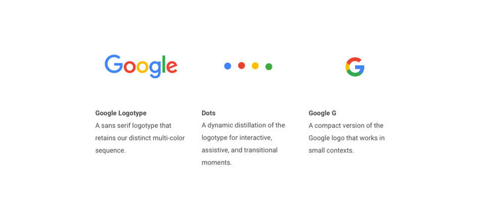
Below is a short selection of clever, responsive logos.
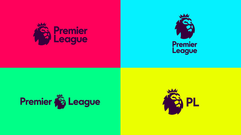
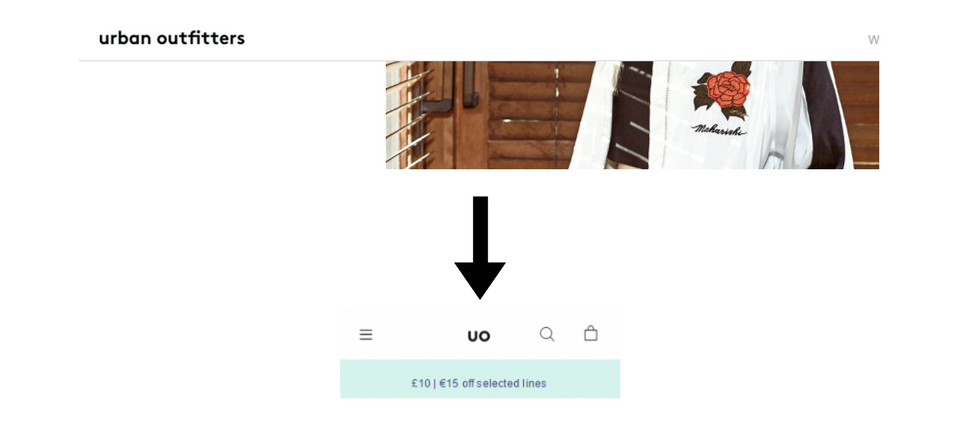
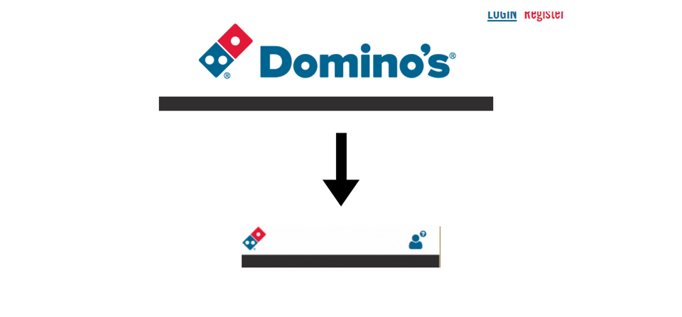
Is that all?
A truly responsive logo is supposed to adapt to the media. And it doesn’t mean only in size and/or number of elements. Being displayed on a screen rather than paper unlocks various opportunities: so why not use them?
Indeed, the design work that leads to creating a responsive logo usually includes animating it. In this perspective, Google and Swisscom are good examples of clever digital brand identity.
What’s your logo style?
Are you planning to create a new logo? Be sure you read first this article about logos you must never choose. Once you know all about that, discover your logo style and create your designers briefing with our short questionnaire.