A brand that creates new dimensions
The architectural office “Jaggi und Partner” in Gstaad combines architecture, interior design, planning, and building into a coherent whole. Due to a change in management, the architectural office wanted a complete rebranding of their visual appearance. The challenge was to reinvent a noble and perfectly shaped brand that would meet the new company philosophy and Jaggi and Partner’s demanding customer needs. Enigma took up the challenge.
Ambition
The classic appearance of Jaggi und Partner was strongly characterized by a rather technical logo and a minimalistic digital appearance. Jaggi wanted a new, contemporary look that would reflect the roots of this traditional architectural firm. Jaggi und Partner is a proud brand with a loyal customer base and the highest of quality standards.
After the business was handed over to three new owners, they decided that they wanted to communicate this new ownership and position themselves clearly with their clientele. This included a refinement of the company profile and a contemporary revision of their visual identity and website.
Action
Creative Footprint
The foundation of the project was a Creative Footprint in which the strategy of the brand, the story, and the communication goal were drafted out. The outcome was the brand history: the architecture creates a common vocabulary between the individual and the room. In its completion, this dialogue results in new and unique spaces.
Once the brand claim “Form und Raum vollendet” had been defined, Enigma formulated the neuromarketing triggers for the new appearance. The self-confident attitude of the office, which emerged from numerous successful architectural projects – “People know us and we appreciate that” – pointed the way for the visual implementation of the rebranding.


Visual design concept
Based on an analysis and the developed brand history, Enigma established a visual identity that places Jaggi as a strong and independent brand. The strategy challenged Enigma to transform the founder’s well-known name into a seal of quality and position it as a brand. Together with the management, it was decided to discard the old name Jaggi und Partner in order to extract the most valuable element from it – the name that customers know and appreciate. The name Jaggi thus became the brand.
Enigma created the visual world around the Jaggi brand, which is determined by the neuromarketing triggers “Prestige” and “Power”. The creation of the branding elements was based on these triggers. A golden beige indicates the color tonality of the brand and is enhanced with several shades of grey and a blue accent. A classically calm font complements the serif font, which adds a touch of luxury to the texts. The ® in the sense of a statement also strengthens the brand.
As the logo is the center of the brand, special focus was placed on the typeface and the font was carefully designed. In spite of decorative serifs, a very constructed typeface was chosen, which expresses the architectural aspect of the font with its linear, filigree form.
During the course of the project, the need arose on the customer side to upgrade the clarity of the brand. Jaggi was supposed to be noble, but not mystical. To find out more about the range, the “Architecture & Interior Design” subline was developed to complement the logo.

Website
The focus of the rebranding was the website. While Enigma aimed for a more classical implementation for the print products, the digital appearance was reinterpreted together with Jaggi. In line with the guiding principle of architecture, which is to explore forms and dimensions, the homepage scrolls horizontally and not vertically. This new navigation was further simplified with reduced content. Therefore only a few sections were created which provide a brief insight into Jaggi’s work.

The navigation of the subpages, in which the content and further information can be found, is classically structured with vertical scrolling. In these sections, users can immerse themselves in Jaggi’s projects and values.


Print, templates & merchandise
In addition to a strong website, Enigma created several print products for Jaggi. While letterheads such as envelopes, business cards, greeting cards, and folders represent the classic branding products, Enigma was also able to venture into the field of architectural plans and dossiers.
The branding was derived consistently from all means and the logo was proudly and prominently placed.
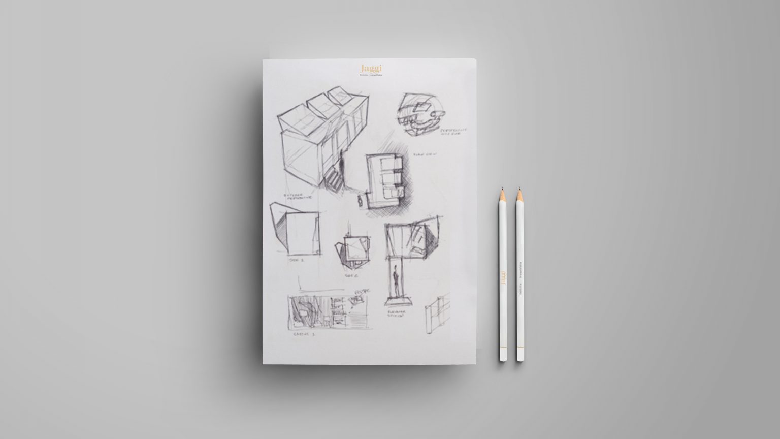
In addition, consumer goods such as cups, pencils and blocks were branded to guarantee that the new image would be fully incorporated into the company.


Impact
Jaggi and Enigma have worked together carefully and made courageous decisions to turn an old brand into a new and powerful one. The principles of the traditional company, its reputation, and quality standards were defined and extracted, then developed into the core of the new branding for a world where analog and digital media merge. The Jaggi brand differs markedly from the rather tranquil character of the Bernese Oberland. Its self-confident presence – conveying a sophisticated world of glamour and jet-set – still meets the local needs of private individuals and the requirements of public buildings thanks to its simplicity and professional depth.