A refreshed website for childcare that doubles conversions

Looking for a daycare or a nanny can sometimes feel like a tedious task. With Kibe Plus’ refreshed online presence, we created a space easy to understand and navigate, promoting contact between parents and the daycare they consider.
Kibe Plus was looking for a way to increase sales and wanted a better website for their customers and staff to navigate. So, the idea was to create a website that can be used as a tool by the team to assist with sales efforts and better analyse their market. Knowing that they handle more than 100 leads per month meant one thing; let’s get to work!
It was time for us to call upon our inner child in order to jumpstart the rejuvenation process for Kibe Plus. The one thing we knew would not change was the logo. So our designer decided to familiarise herself with it.

The idea was to keep the colours because they are the first ones we learn as children. Then, to accentuate the playfulness and educational atmosphere, we decided to use the shapes of a child’s box puzzle, one of the first toys they interact with.
These colours are central to the rest of the design, but ultimately we decided to especially focus on the red and the blue, so not to overthrow the user. Some modules were later developed using those colours as background to create a more interesting user flow.
The playful tone was crucial to us but we also needed to make sure that all important information was easy to find in order to boost usability. To do so, we created a user journey through personas to better discern what our audience needed to absolutely know so that we could build a home page including all the essential material.

“Our prior website felt outdated and unintuitive. We approached Enigma to see what they can do about it. And, they delivered: The website features a handy backend and a smooth user flow with a human touch, resulting in increased engagement and conversion.”
Lucien Brahier, director
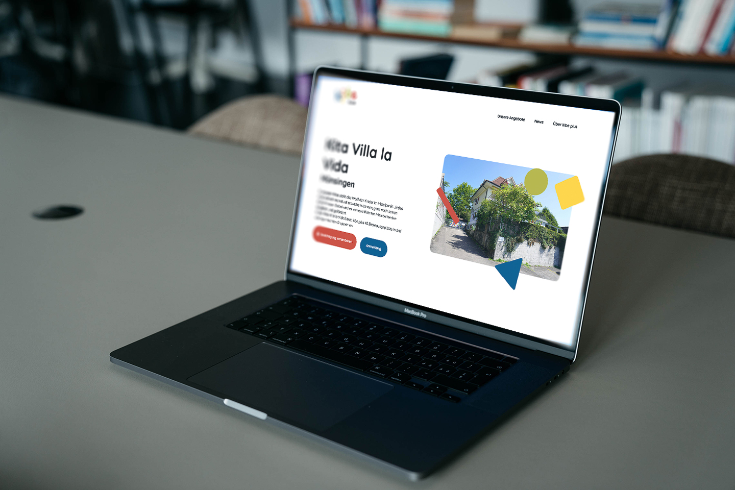
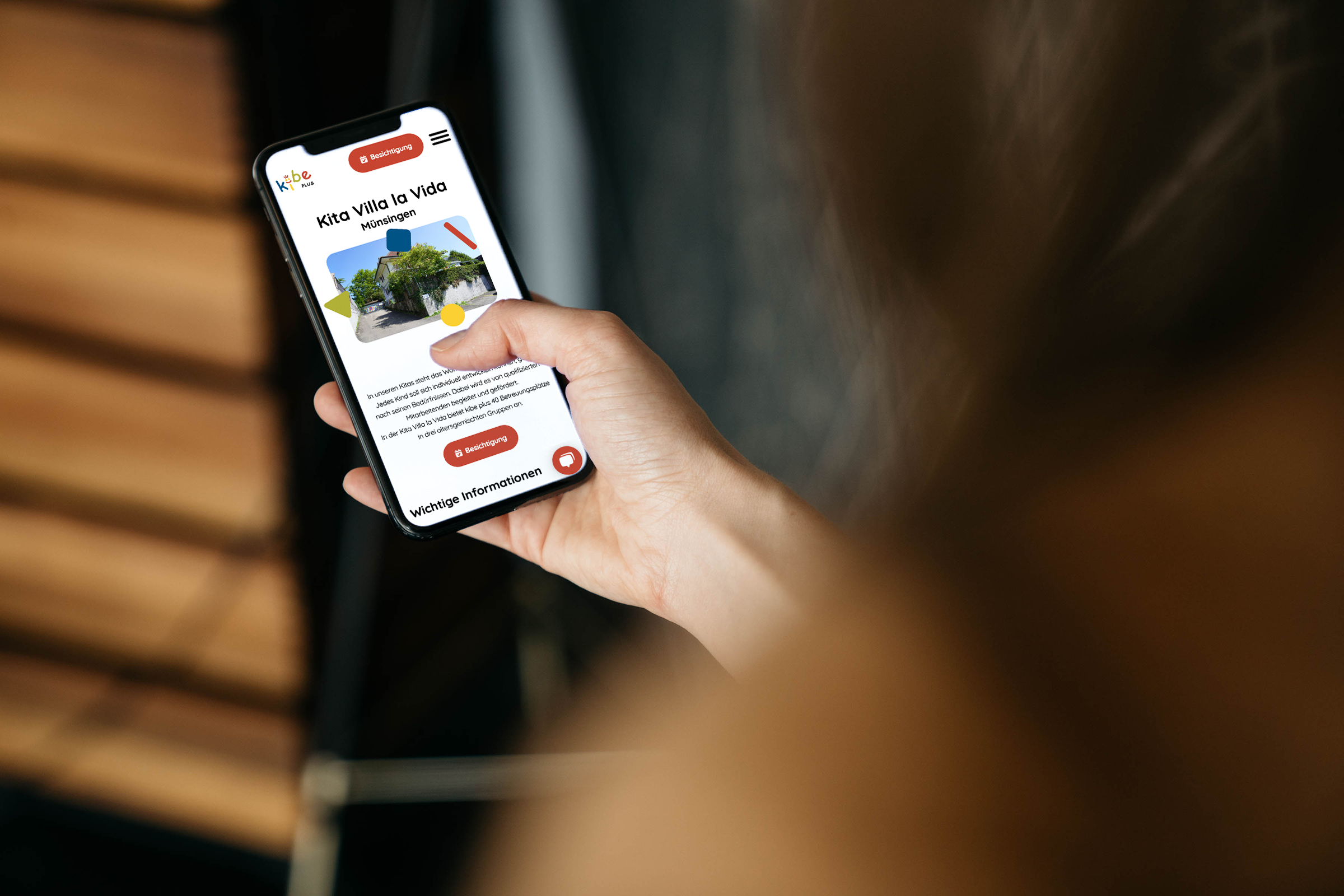
The big change was that we transitioned from an aged design that made navigation difficult to a simple to simmer through, modern visual journey. Another was to make this website as mobile friendly as possible to help parents on the go quickly go through the choices of daycares and make bookings easily.
We implemented an option where the user can book meetings to go and visit the daycare or meet the nanny simply through the website.

We also added an interactive calculator, optimised for mobile as well, to offer transparency and help parents better budget their childcare needs.
Thanks to the Hubspot implementation, we create an easier way for existing and potentially new customers to contact their daycares or the Kibe Plus headquarters. This also will assist in client retention by making sure that the company can reach out to its customers.
Additionally, incorporating a live chat also boosts the ability of creating direct contact, making the website more user-friendly.
This is what we have achieved for Kibe Plus
- A new dynamic website design inline with their existing identity
- Created a user journey that simplifies the user’s journey with something as important as daycares
- Implemented a CRM to facilitate client retention and boost acquisition of new clients
- The Hubspot implementation also allows the users to contact daycares or the Kibe Plus Headquarters directly
- with the ability to arrange a viewing directly or chat live with us, the site became much more customer friendly
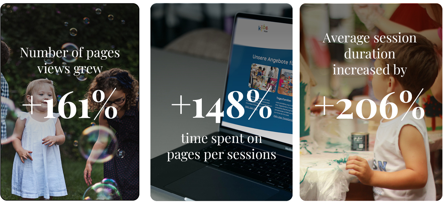
- The bounce rate (visits to a single page without interaction) has decreased by 43.26%
- Website built as a Craft CMS


