
Development of the brand, design and appearance of a group practice
For the opening of a group practice offering speech therapy and occupational therapy, Enigma Strategy & Branding developed its brand, design and overall appearance.
Ambition
A newly-founded group practice in Thun, Switzerland, specializing in hand and speech therapy, engaged Enigma for the development of a corporate brand identity and design as well as a voice to reflect that brand.
Action
Strategy
The two distinct therapeutic disciplines demanded a clear differentiation between the two services yet with a consistent visual identity as a group practice. After running an initial workshop with the two founders, Enigma developed the name and the design of the corporate brand.
The speech therapy arm of the practice Fischers Fritz owes its name to the famous tongue twister “Fischer’s Fritz fishes fresh fish. Fresh fish fished Fischer’s Fritz”.
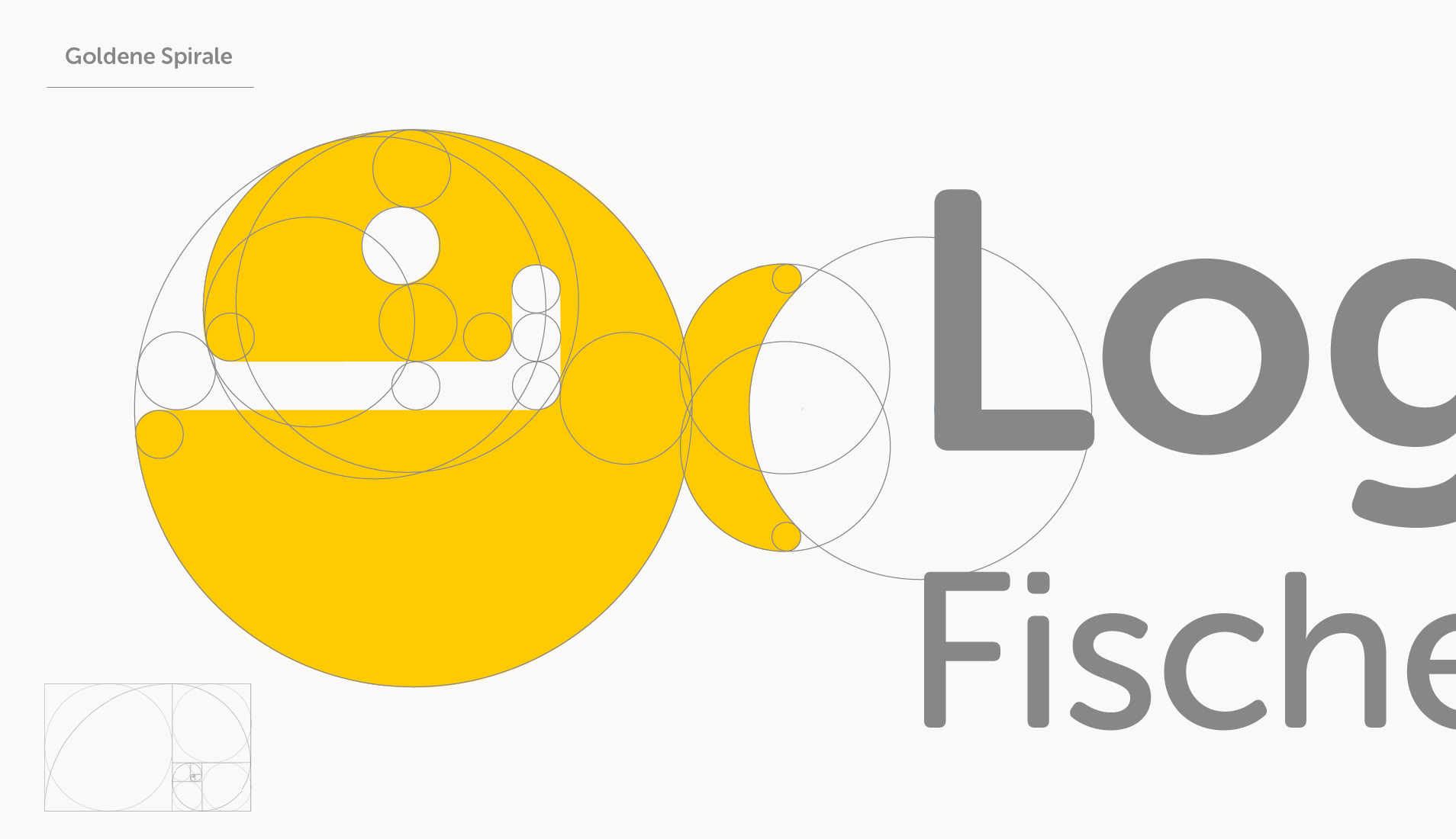
It thus represents a humorous approach to speech therapy, along with the “friendly Obelix”, as it has been called in Enigma’s drafting. The practice’s logo depicts a fish with a large letter ‘L’ in its mouth – the ‘L’ for Logopädie, which is German for speech therapy.
The part of the practice offering hand therapy is called “Occupational Hand Therapy,” specializing in occupational therapy treatments for the hand and its peripheral nerves. While the speech therapy arm of the practice has chosen children as a target group, in occupational therapy, it is the aspect of confidence that plays an important role.
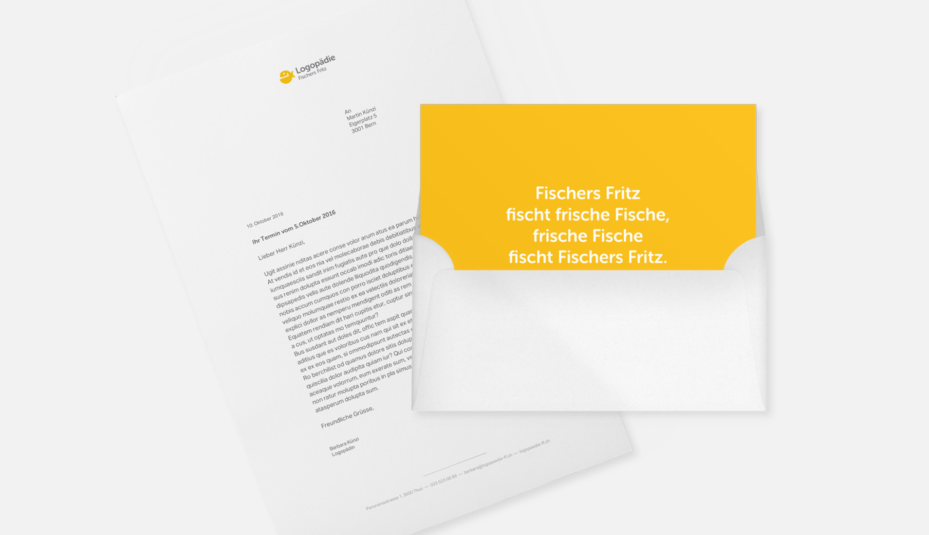
The cheerful yellow colour theme differentiates the group practice visibly from other healthcare providers. The attractive coloured background of Fischer Fritz Speech Therapy’s stationery bears the tag line “Fischer’s Fritz fishes fresh fish”. A classic business card was not required, which is why a folding card was created instead, which can accommodate notes and can be discarded.
Corporate Design
The logo harmonizes the two disciplines perfectly based on the principles of design science, while still conveying a clear message.
The cheerful yellow colour theme differentiates the group practice visibly from other healthcare providers. The attractive coloured background of Fischer Fritz Speech Therapy’s stationery bears the tag line “Fischer’s Fritz fishes fresh fish”. A classic business card was not required, which is why a folding card was created instead, which can accommodate notes and can be discarded.
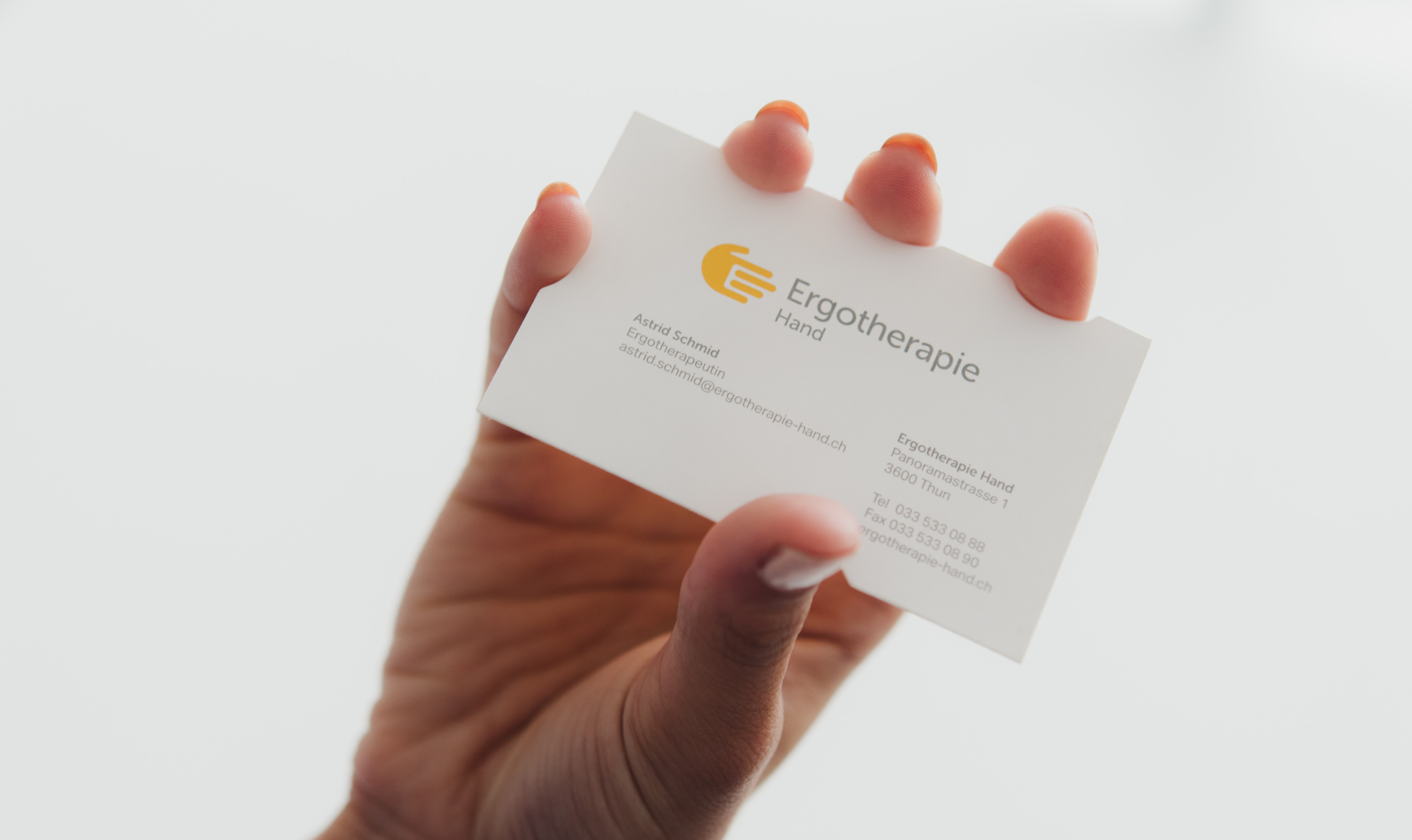
The Occupational Hand Therapy has a unique and attractive business card and reminds the viewer of the ergonomic grip function of the hand.

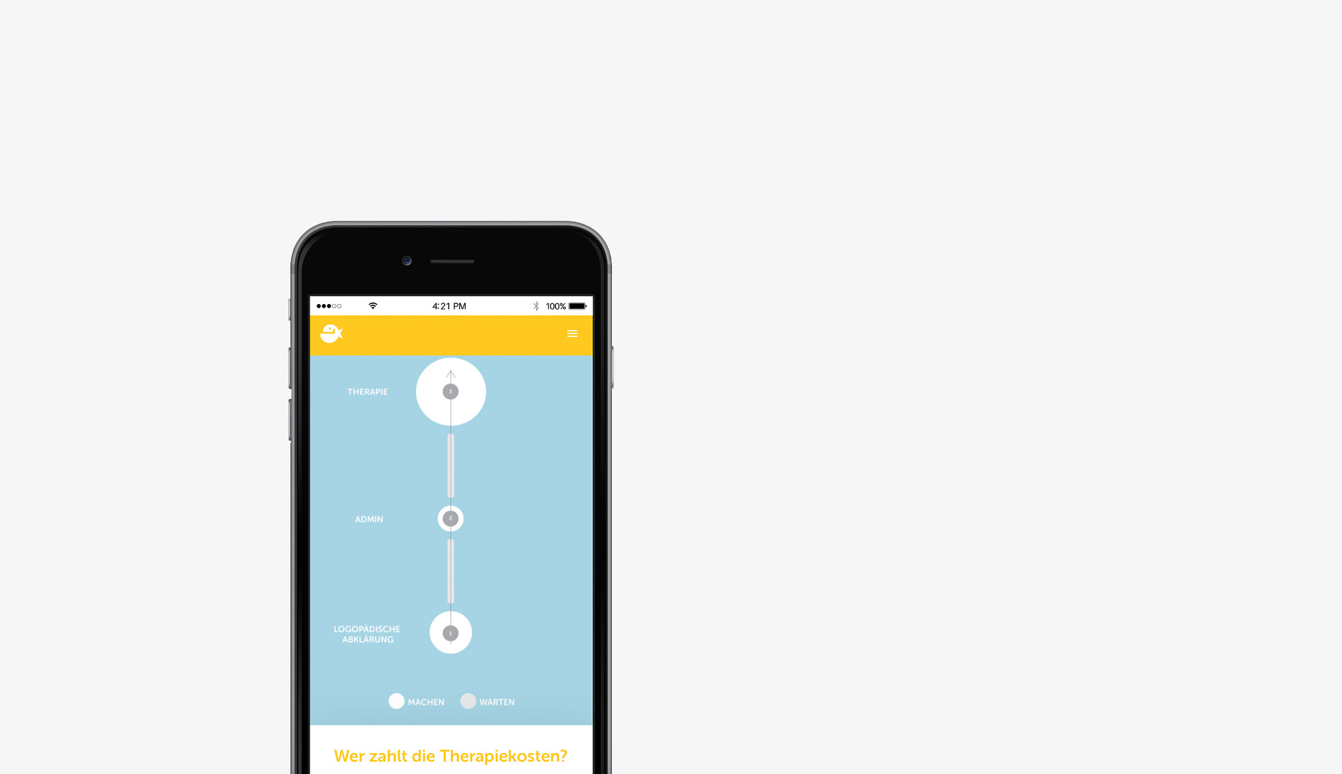
Both websites provide clear information on the specialized range of their services; they are built on the same theme, but are independent of each other. They are fully responsive and among the most innovative in their industries, and also include video integration.
Impact
Brand, design and communication elements are perfectly matched within the two speech therapy and occupational therapy disciplines. As a group practice, they also work side by side unambiguously, while retaining their individuality.
Credits
Impact
Brand, design and communication elements are perfectly matched within the two speech therapy and occupational therapy disciplines. As a group practice, they also work side by side unambiguously, while retaining their individuality.


