Reinventing Enigma
Enigma is exploring new, ever shifting worlds
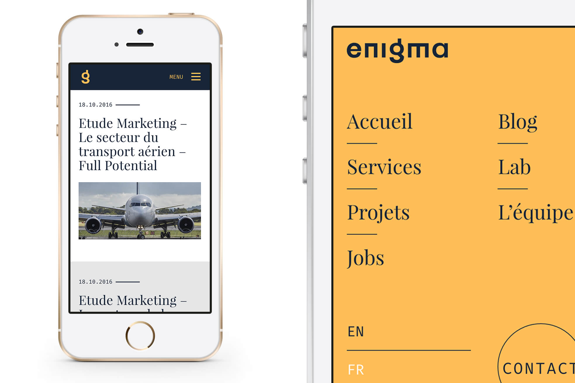
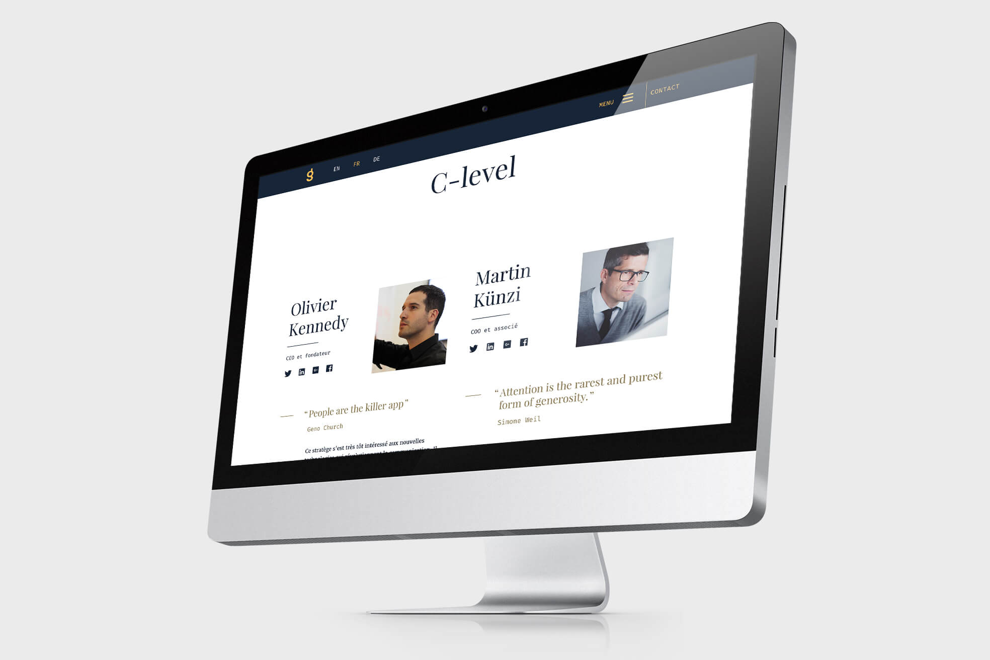
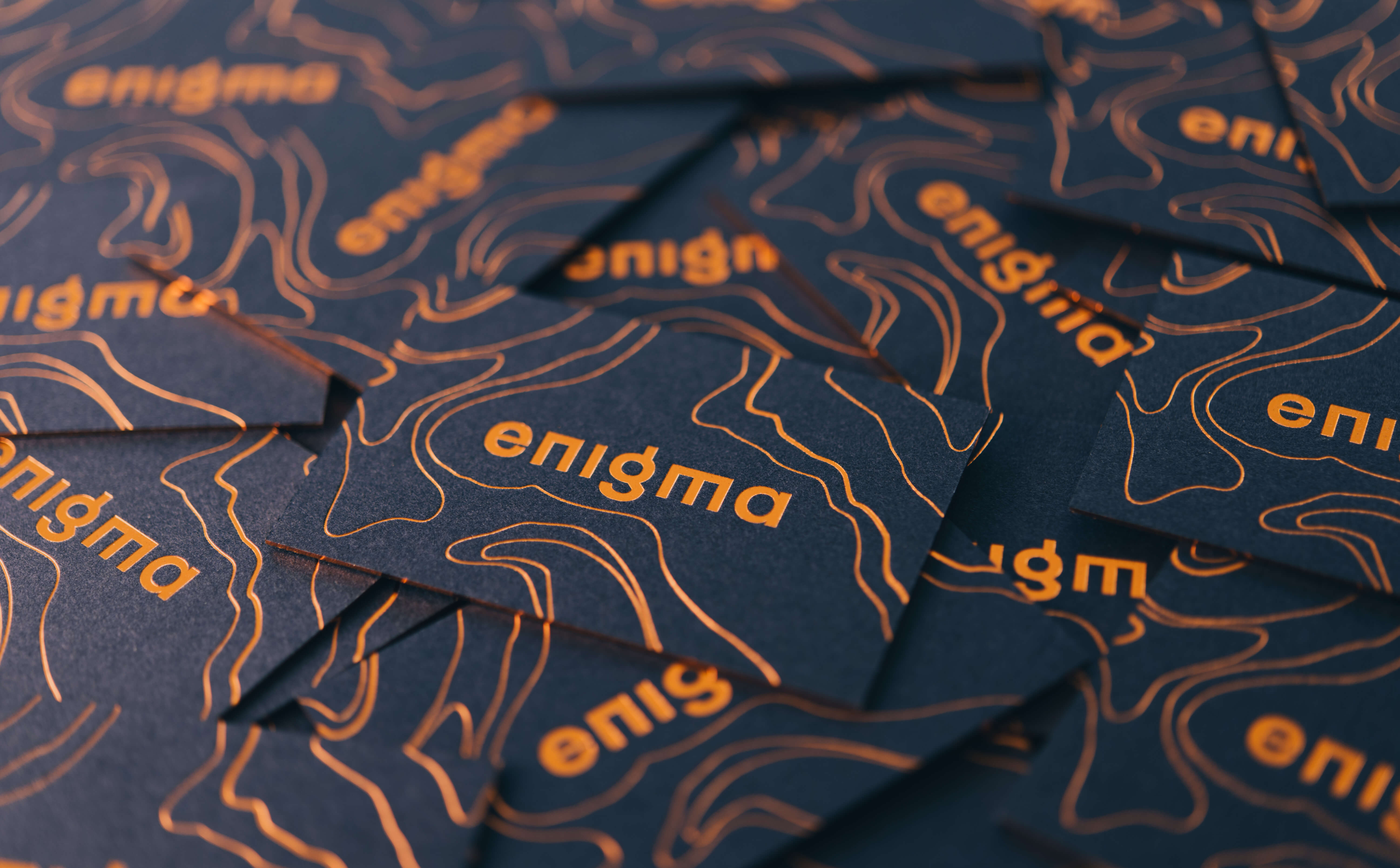
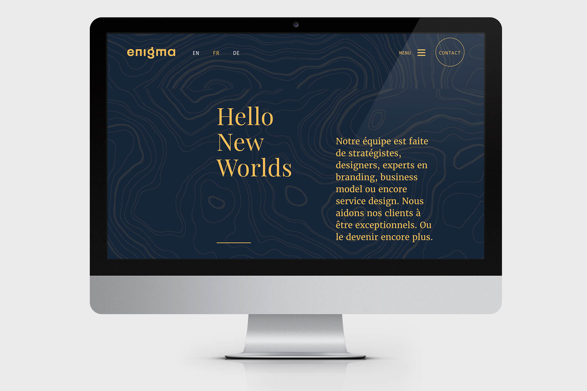
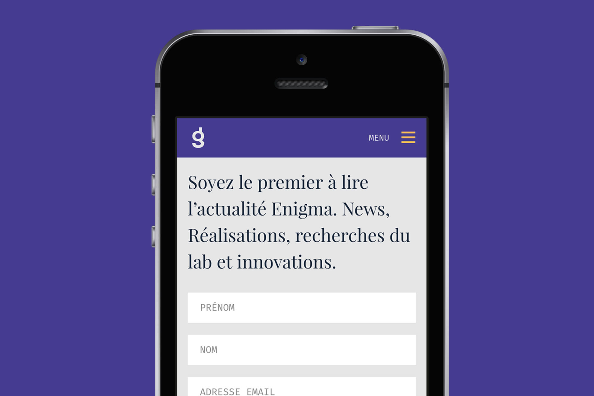
Since August 2016 Enigma has been showing an all-new look and feel. We developed a new visual language that was spread all over our website, business cards, presentations, spreadsheets, documents and offices.
Ambition
From media consumption studies to the exponential growth of adblockers, all indicators are unanimous: very soon, advertising will be useless. In a world of algorithms, artificial intelligence and word of mouth, organizations cannot simply tell a great story or just look good. They have to offer a great experience.
“We are Enigma. We help our clients become great at what they do. Or become even greater.”
This vision lead Enigma to broaden its service offer over the past years. We run Business Model Generation workshops. We integrate CRM solutions. We automatize sale processes. We design websites that are real business tools for our clients.
In other words, we have changed a lot since 2008. We know that. Our clients know that. But we felt the need to show it so in spring 2016 we embarked on a rebranding project again. Only this time we were the client.
Action
Our world is evolving faster by the day. Climate change, geopolitical instability, society shifts, new tools, growing interconnection of multilateral systems. There is no doubt our environment is getting more complex every day.
We feel our role is to explore and map this transforming universe so we can guide our clients to reach their objectives. So Enigma decided to depict itself as an explorer. We now use terrain lines, multiple indications and other topographical references to express mapography and territory.
“We decided to inspire after the great explorers of the 19th century. Howard Carter, Dr Livingstone and Jules Verne all live in our visual language.”
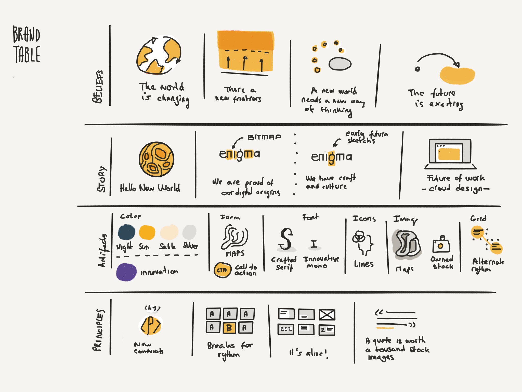
After discussing the company vision and objectives with the C-level, the team used our Creative Footprint methodology to define the building blocks of our brand: Why, Archetype, Brand story, Promise, Brand map and Neuromarketing triggers.
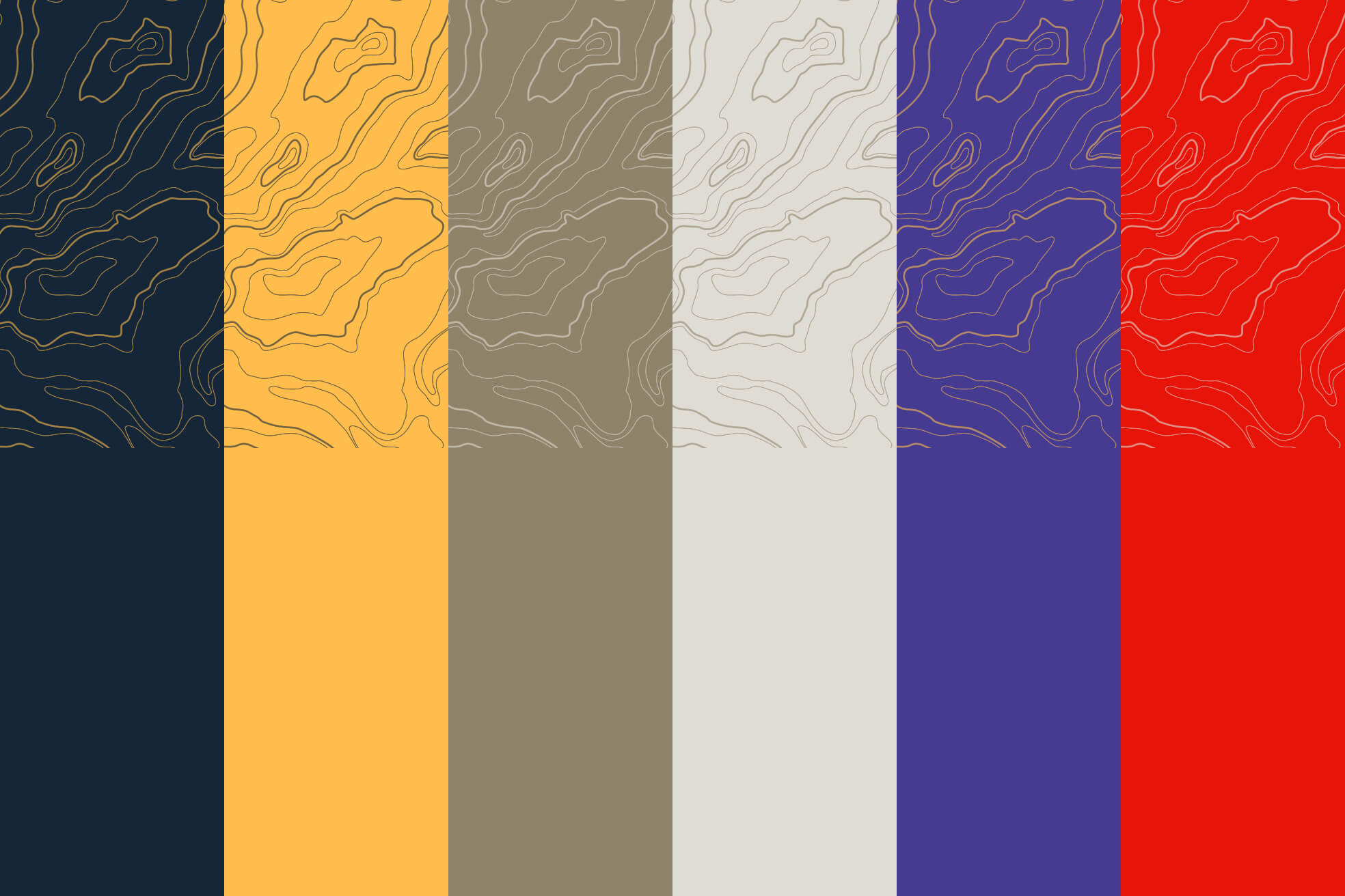
Then the creative team went on to design the basics of our new visual language.
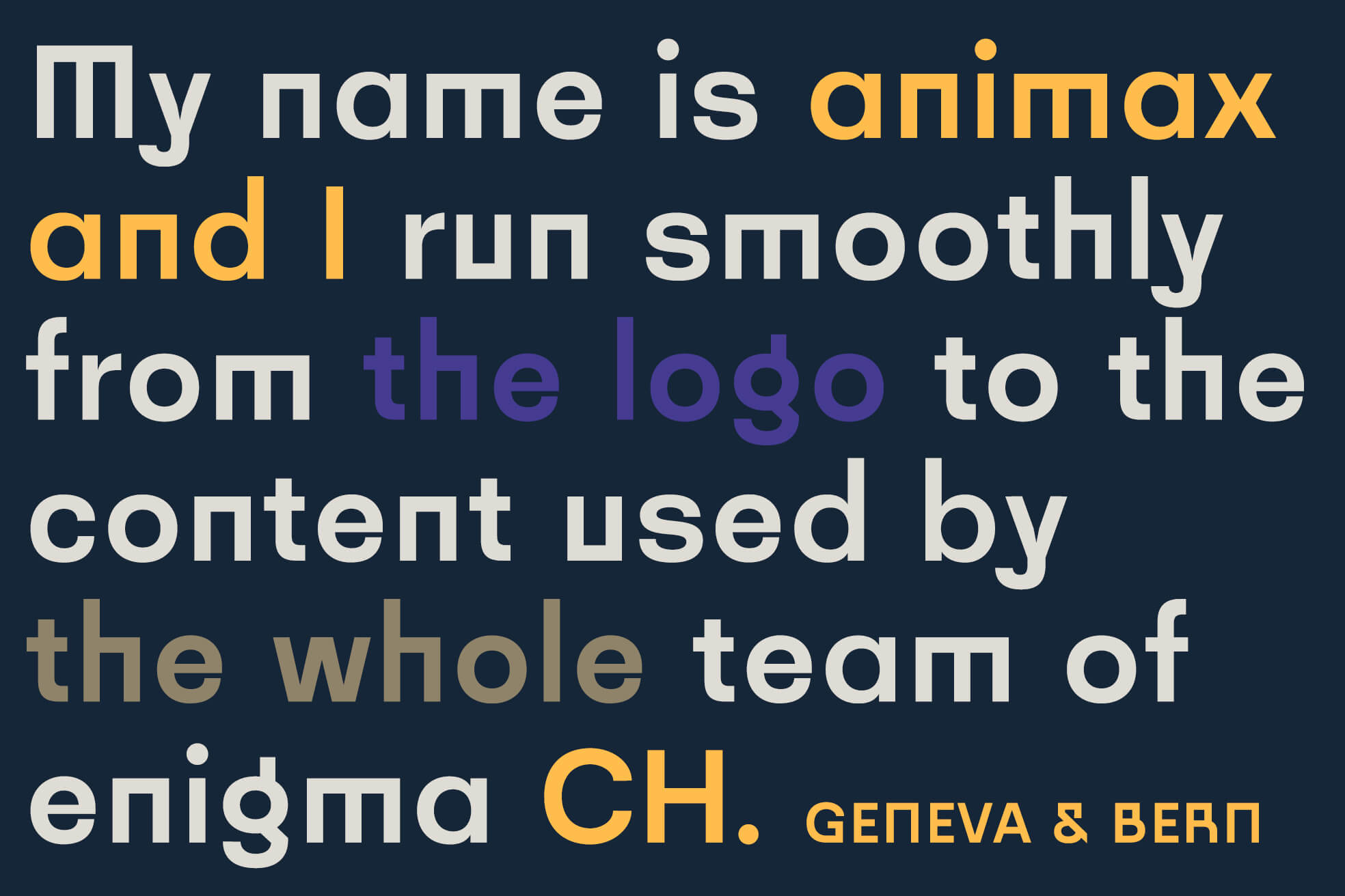
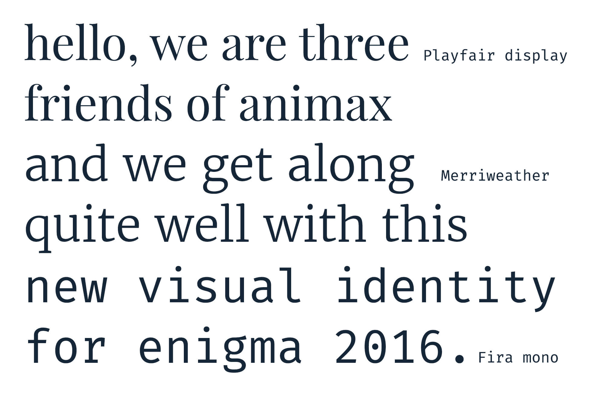
Our new identity is based on a somehow classical typographic approach, bold colors, and magazine-inspired aesthetics. Our in-house typeface specialist designed the Animax typeface to create our new logo. But since we only work in the Google Cloud with Google Docs, Sheets and Slides, we mainly rely on Google Fonts.
