
A punk branding for a wine company
Enigma was contacted by Wine District, a new storage cellar in Geneva, to develop their brand identity and implement a launch strategy.
Ambition
Born from the association of two young and talented entrepreneurs, Wine District is more than just a storage cellar, it is also a place of conviviality where passionates and wine lovers can meet and exchange, far from conventions.
Wishing to break the codes of this sector and make it accessible, Wine District wanted to create a clash with the perception of the sector while highlighting their vision and purpose.
The challenge for Enigma was therefore to ignore and question everything that is done in this sector while accompanying the brand in its quest for a deep identity in order to express it through various medias and actions of communication.
Action
Define Wine District
Through various workshops and exercises, in collaboration with the founders of the brand, Enigma first started working on the definition of the brand, its raison d’être but also its personality.
As a result of this first phase, Enigma has developed a disruptive branding based on a universe of punk inspiration, going against the rules, allied to the natural elegance of wine and conviviality.


Logotype and corporate identity
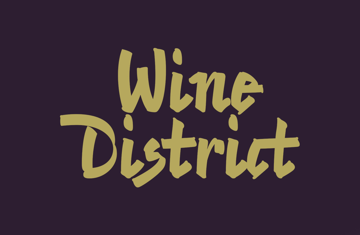
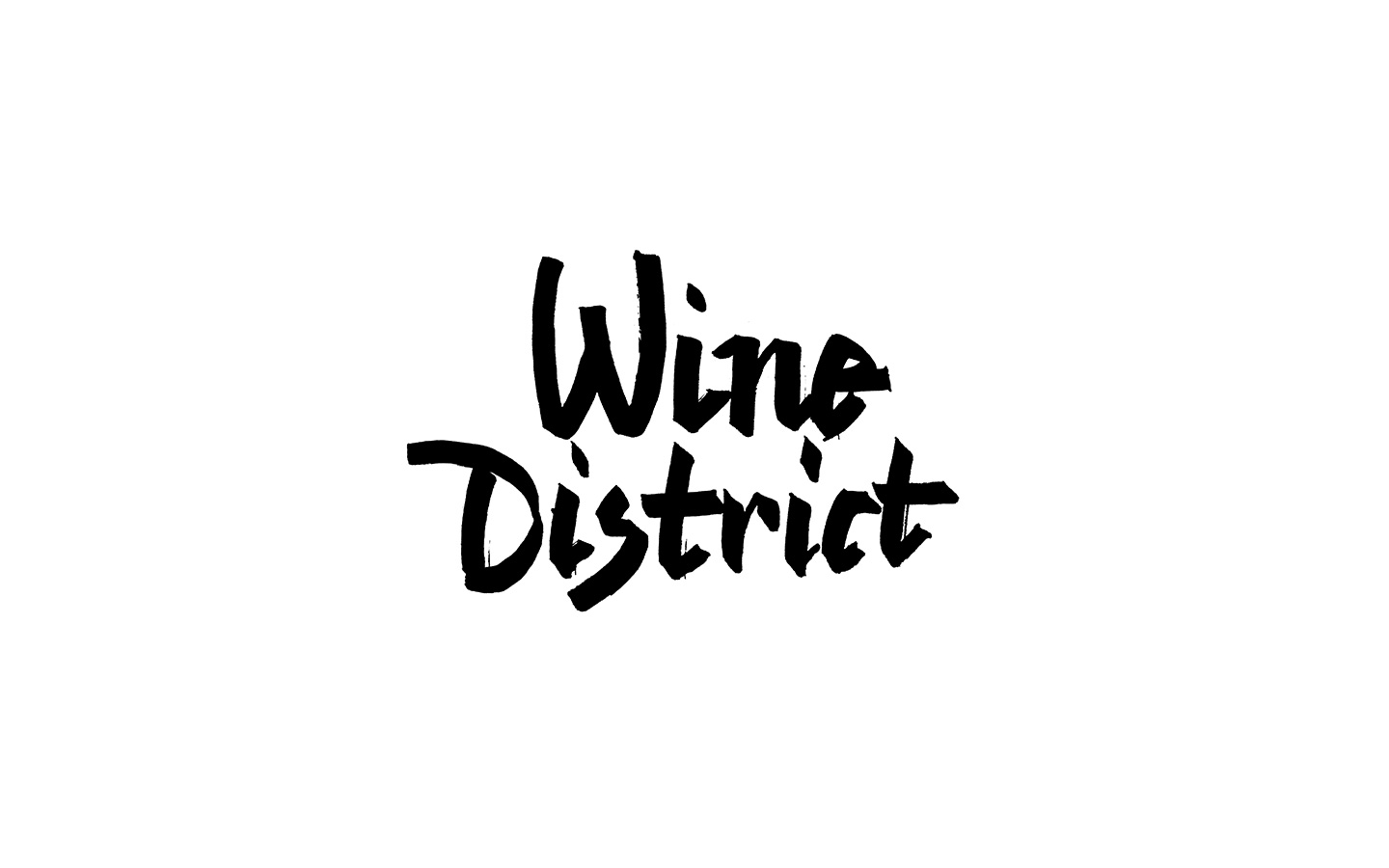
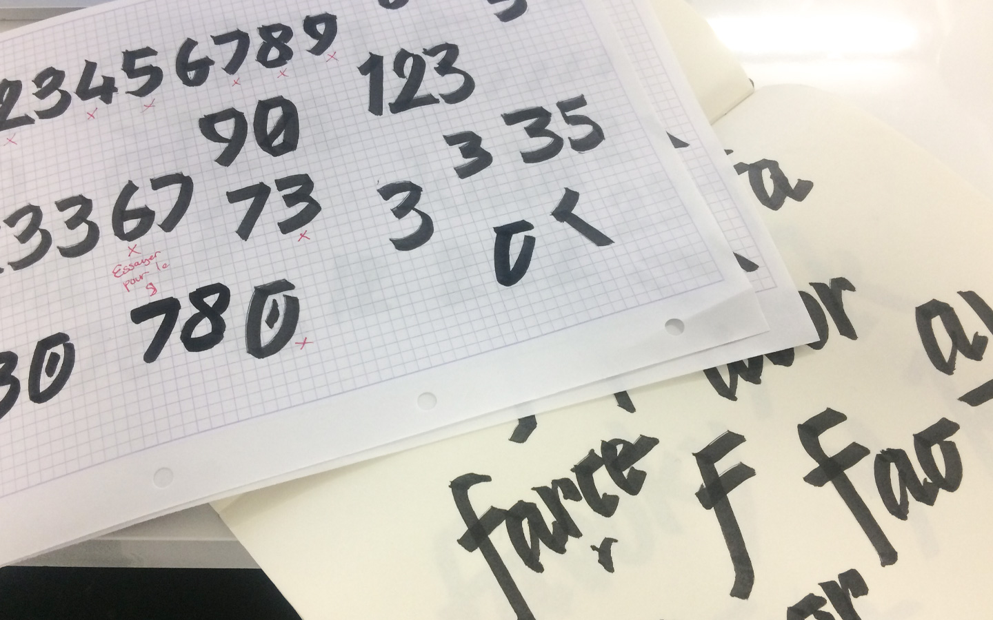
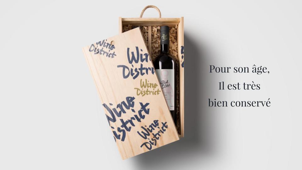
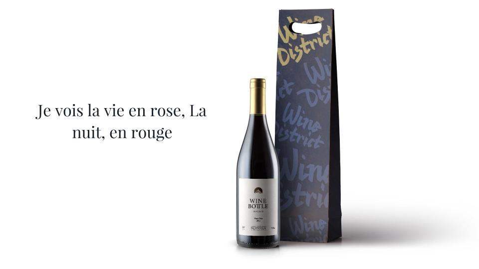
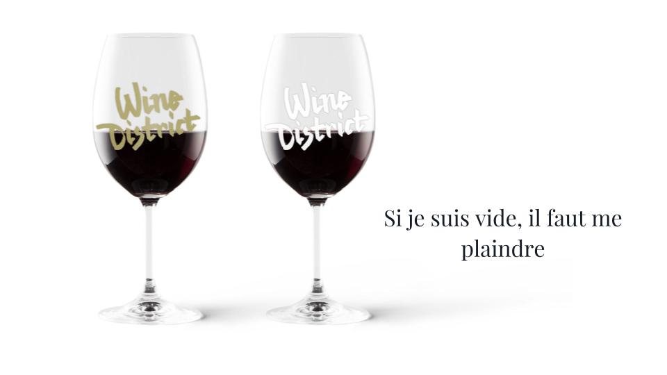
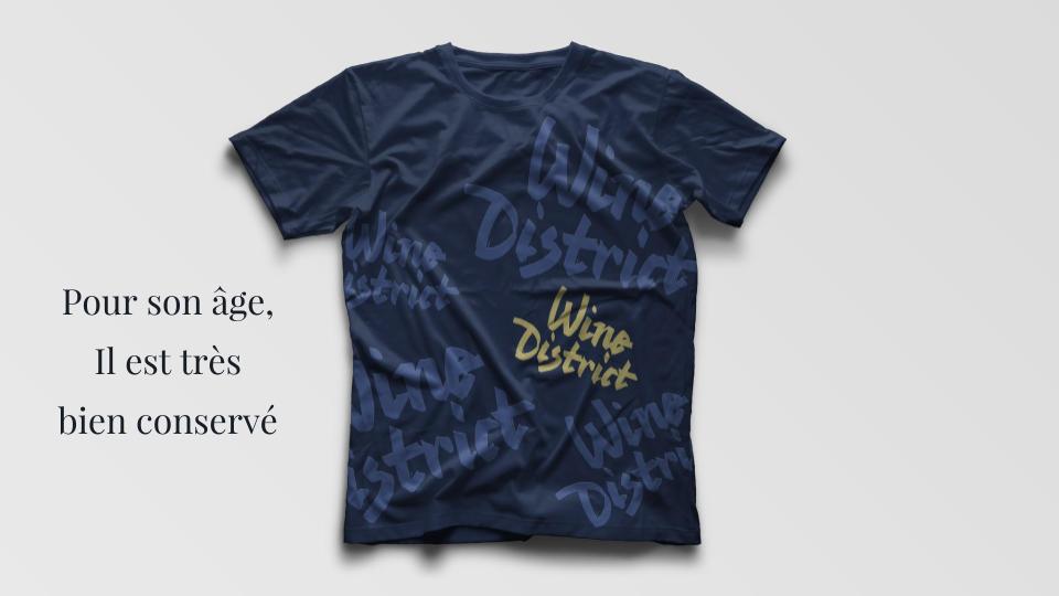
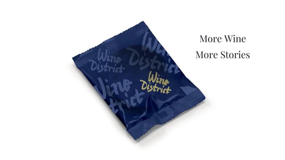
In order to transcribe the punk spirit of Wine District in a subtle way, a great typographic work was initiated and developed by Enigma’s great designer and typographer, Loris Olivier.
Thus, a typography was created specifically for the logo, inspired by the spontaneous handwriting, as in punk places of London in the 90s and specifically on posters and polaroids.
The goal was to express a spontaneous personality, ready to make the most of every moment.
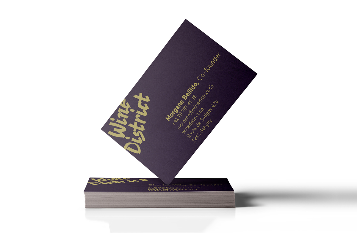
The graphic universe surrounding this logotype has been developed around an association of colors reminiscent of the elegance of the wine, such as a deep red and a shiny gold, while bringing with it some punk keys such as inclined text and polaroids to illustrate the various services offered by wine district.


Community Management
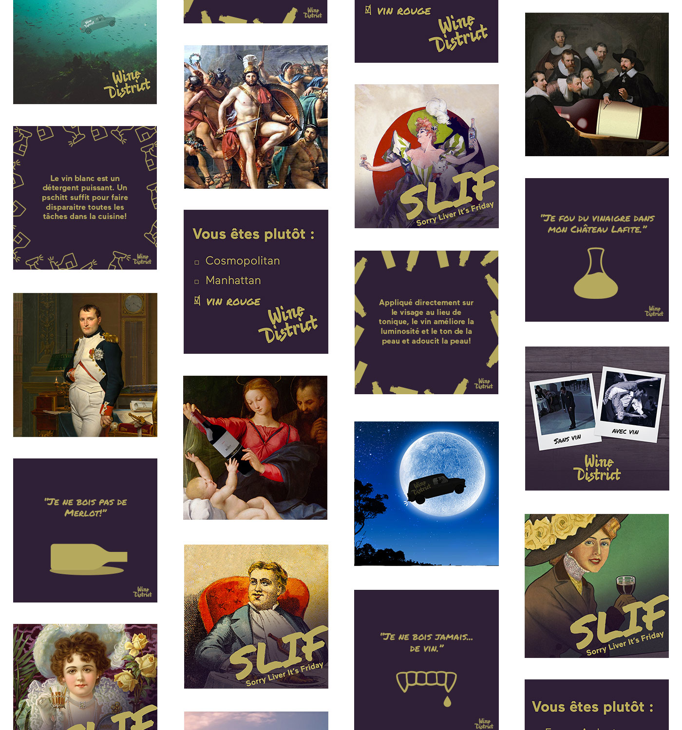
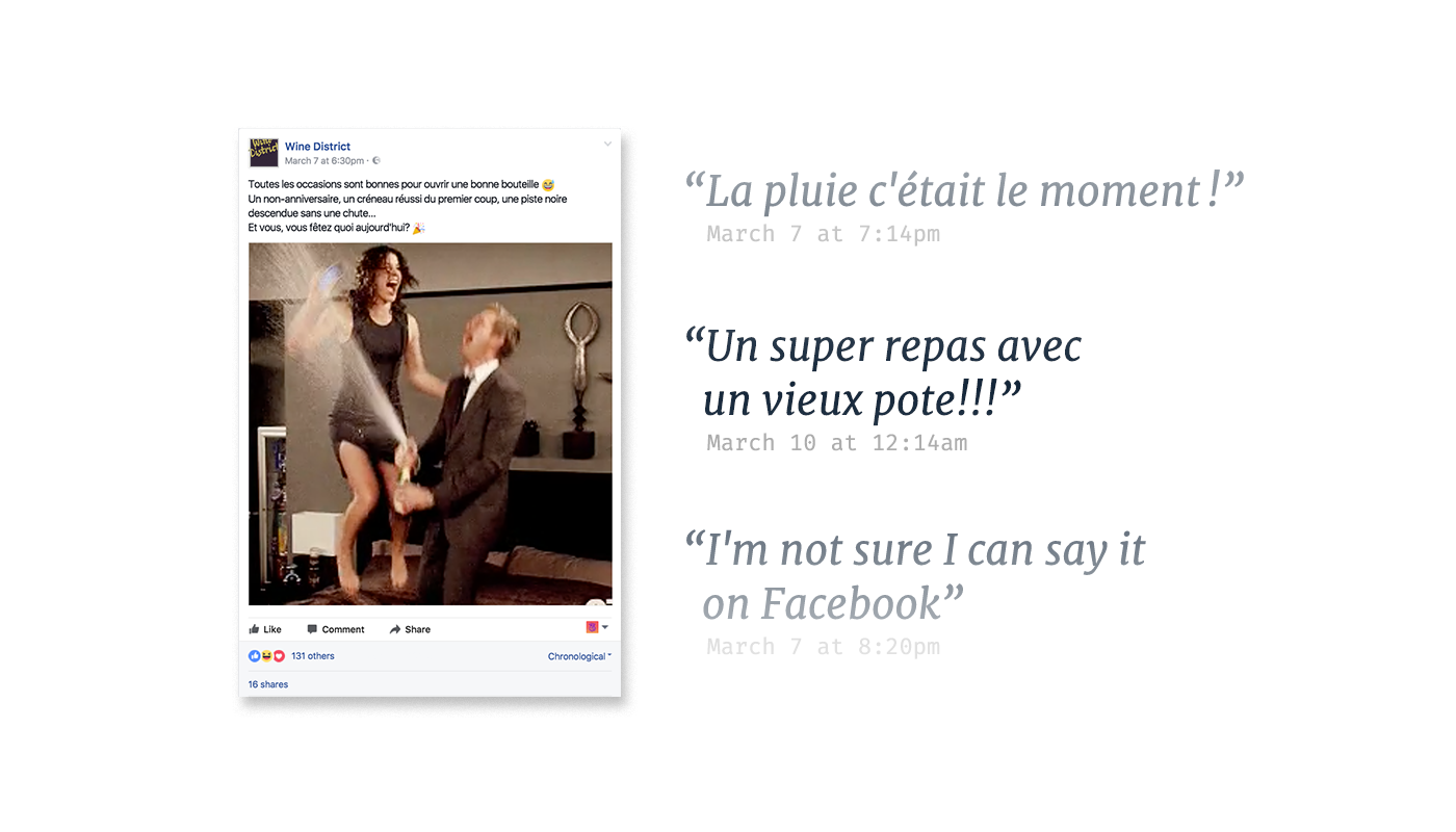
In order to create awareness around the brand while keeping this punk and unconventional spirit, Enigma has developed fifteen unusual and fun creative concepts in order to animate the Facebook page of Wine District and to provoke the maximum of reactions.
Enigma has set up an astonishing and humorous community management for the delight of their fans, thanks to photo editing, illustrations, gifs and video clips.
Impact
Thanks to a unique and disruptive strategy, Wine District has been able to differentiate itself from its competitors and to be known in an increasingly competitive sector.


