Salvation Army: A website based on user research for a non-governmental organization
Enigma renewed the web presence for Salvation Army Switzerland, one of the largest NGOs.
Ambition
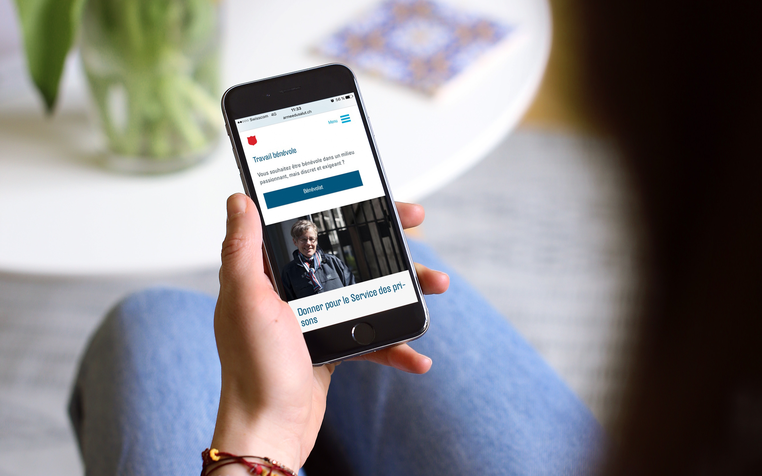
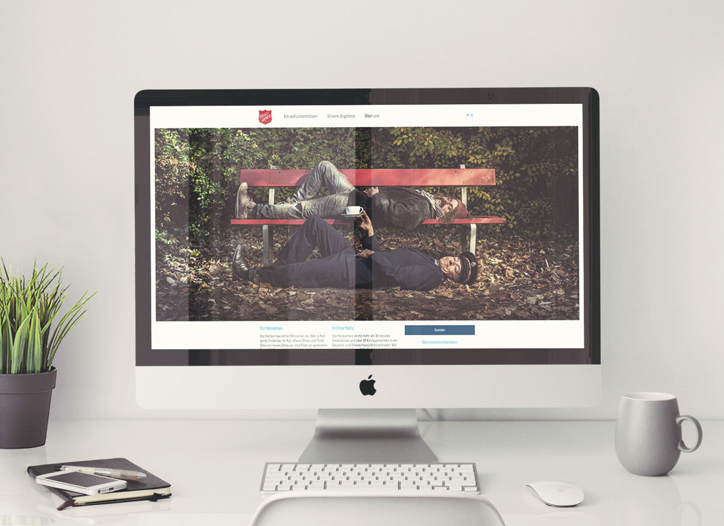
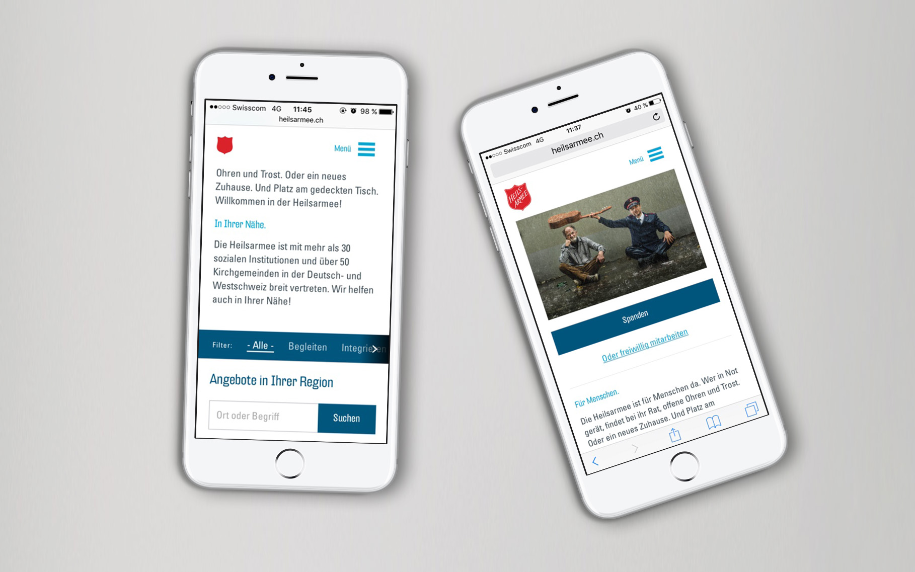
Enigma’s goal was to build a website that is relevant and comprehensible to the user, while meeting the latest trends.
Action
Design based on user research
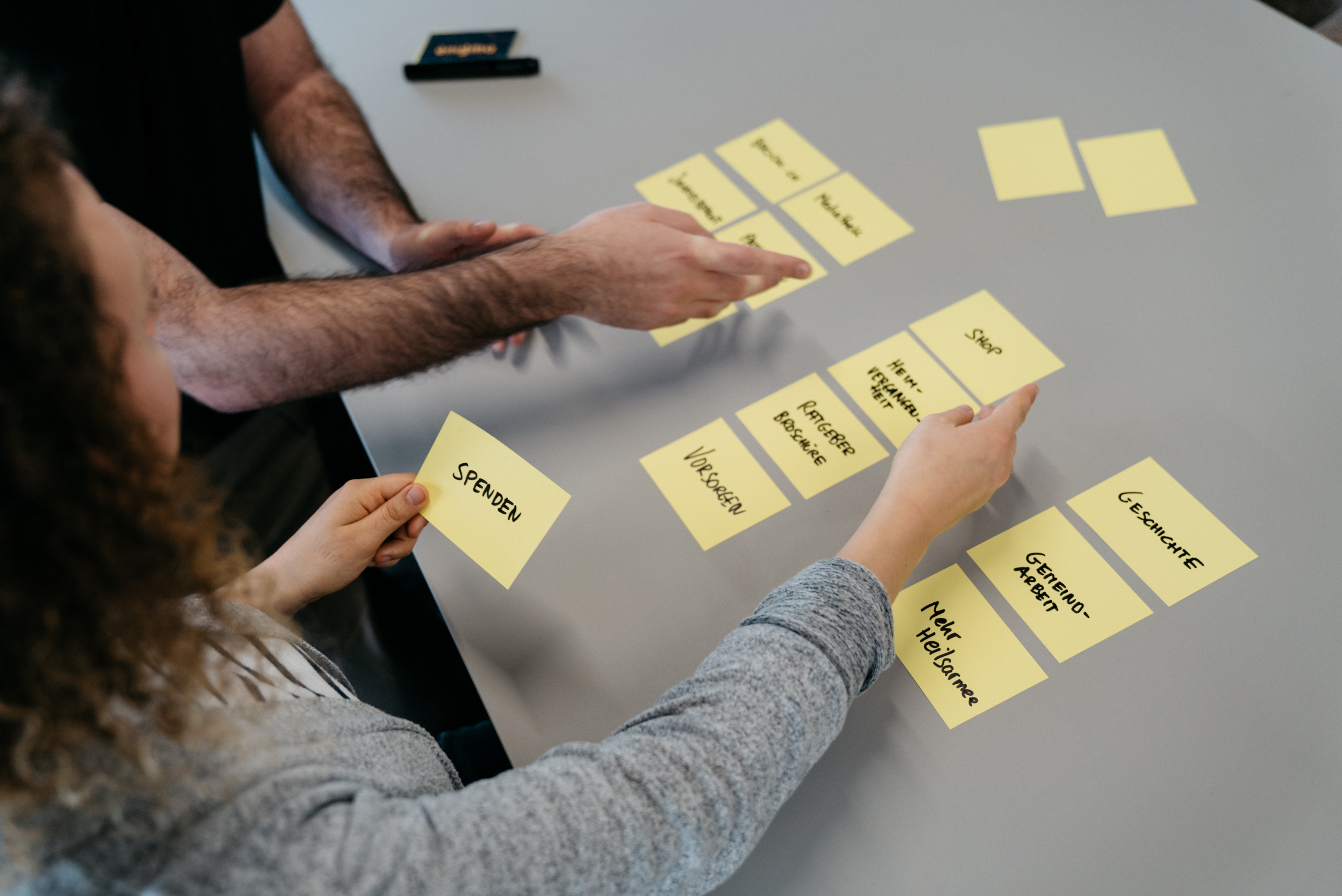
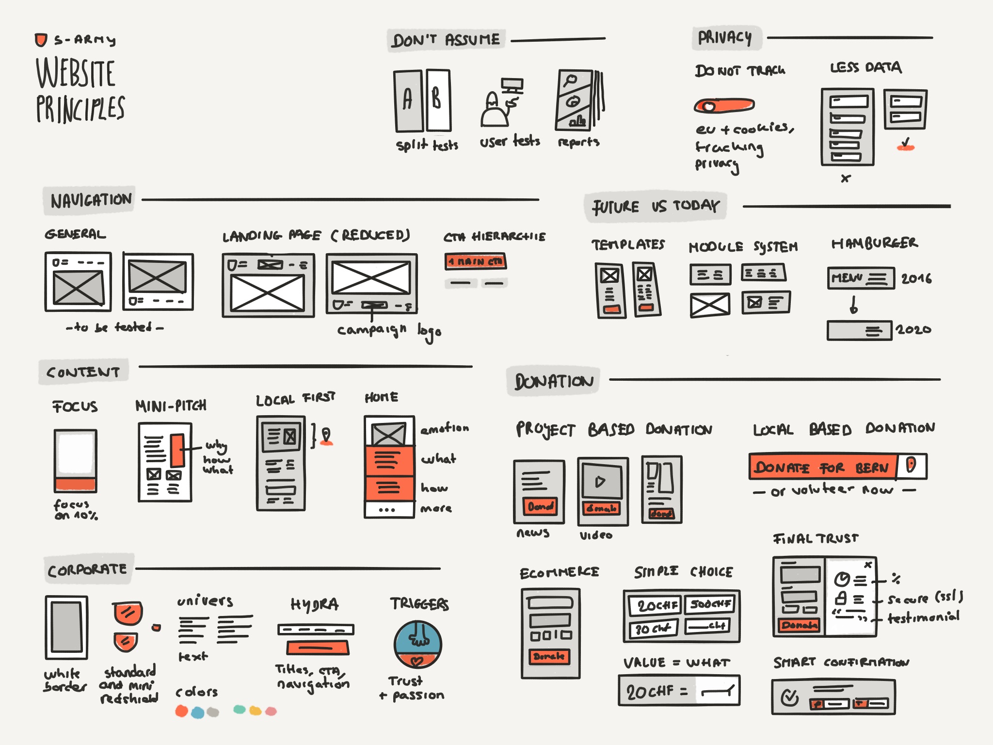
Based on Enigma’s Brand Strategy System, we conducted a comprehensive analysis and exploration. This included not only an analysis of other NGOs, best practices and trends, but Enigma also made quantitative and qualitative user tests in addition to a workshop with the Salvation Army. With the help of test persons from the target group and by using accompanied interviews, we tested the user-friendliness of the website and gained important insights into usability and the user experience.
These foundations allowed Enigma to design a website that can not only score with its looks, but can also be understood by the users. The stress field was that design requirements and usability criteria often diverge. On the basis of prototypes, the priorities could be carefully crystallized, core functions discussed, and finally the right decisions could be made.
A barrier-free website
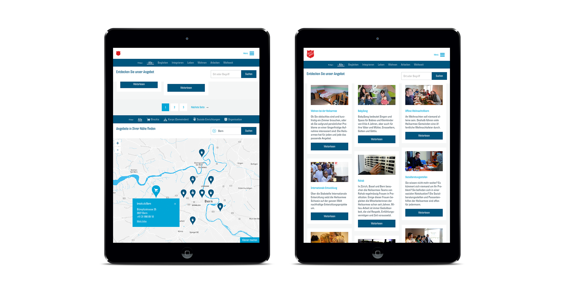
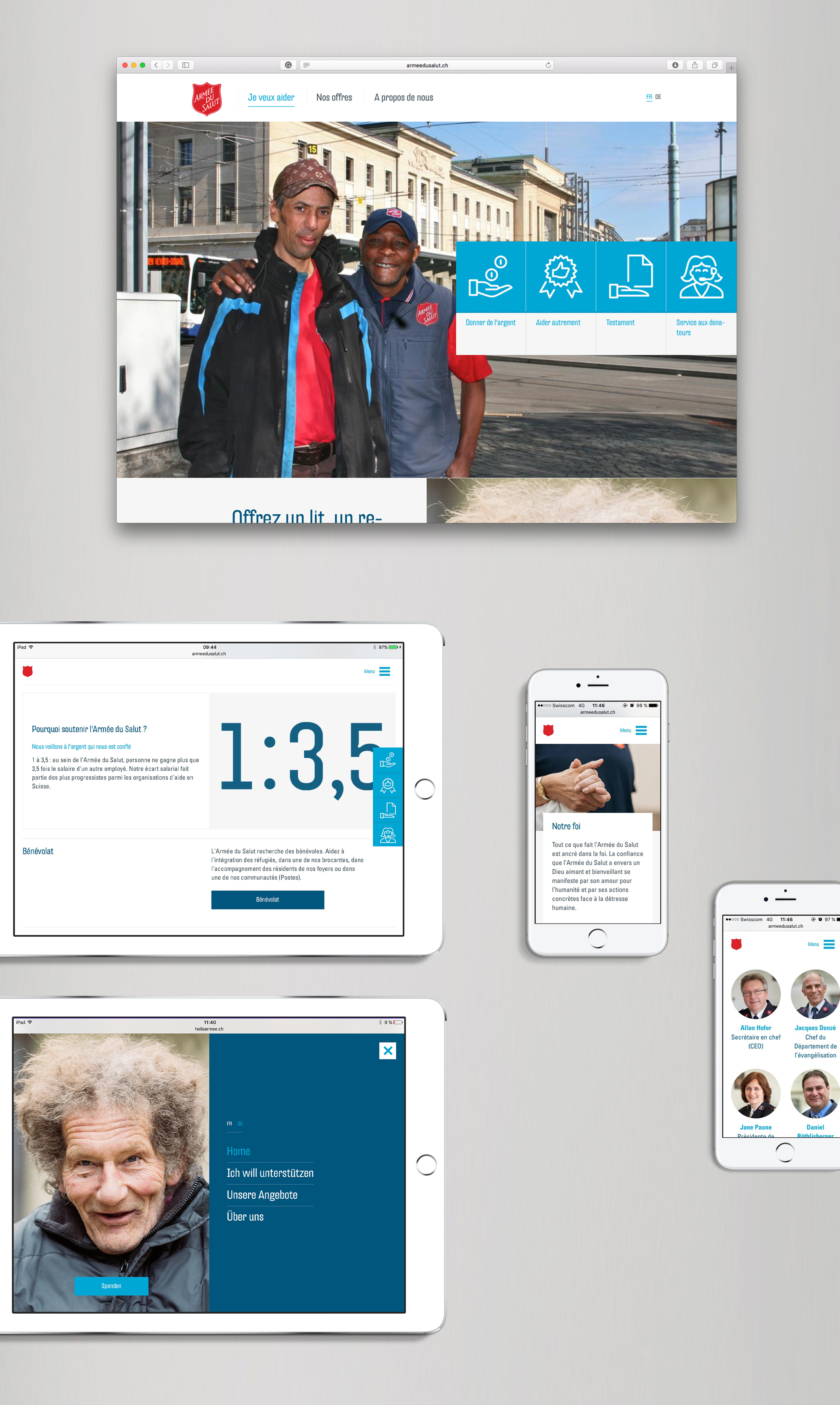
As an NGO, accessibility is central. Enigma optimized the entire website based on WCAG rules. We also designed a unique sub-navigation that combines the content of the site with the help of icons and concise keywords. Users not used to scrolling can quickly and easily access the information they are looking for.
A modular and flexible structure
The modular system of the website and the interfaces to internal databases of the Salvation Army allow for a simple and flexible operation of the website. In this way, individual modules can be flexibly added or removed, or completely new pages can be created individually. This allows for extreme freedom in the design in comparison to rigid templates.

Emotional donation process
Enigma designed a donation process, which clearly stands out from other NGO processes: Testimonials lend emotionality to the donation process. Icons and graphics also showed where the donated money flows and thus enables maximum transparency.
Website with focus
The analysis of the Salvation Army Website confirmed the findings of various studies that only about 10% of the content of a website is visited by a wider interest group. For this reason, Enigma greatly simplified the basic structure of the site and recommended a massive reduction of content.
Based on user testing, the arrangement of the offers was also reconsidered. For example, the offers are represented with a tile system in the sense of organized chaos. A filter serves to quickly get the user to the desired offer.
