Swiss Efficiency: brand architecture for a Swiss start-up in the solar energy sector
Enigma was asked by a solar energy production group to create their group’s complete branding and brand architecture with its sister companies.
Ambitions
Enigma’s goal was to create a strong Swiss brand for this innovative start-up.


Actions


The brand architecture
As all of the sister companies have their own strong identity, it was important not to weaken these by forcing them to fit into a restrictive system.
For the sister companies, a special version of the wordmark saying ”Powered by Swiss Efficiency“ is used as a signature. This signature works as a quality assurance and creates a link between all of the different sister companies in a subtle and prestigious manner.

Branding
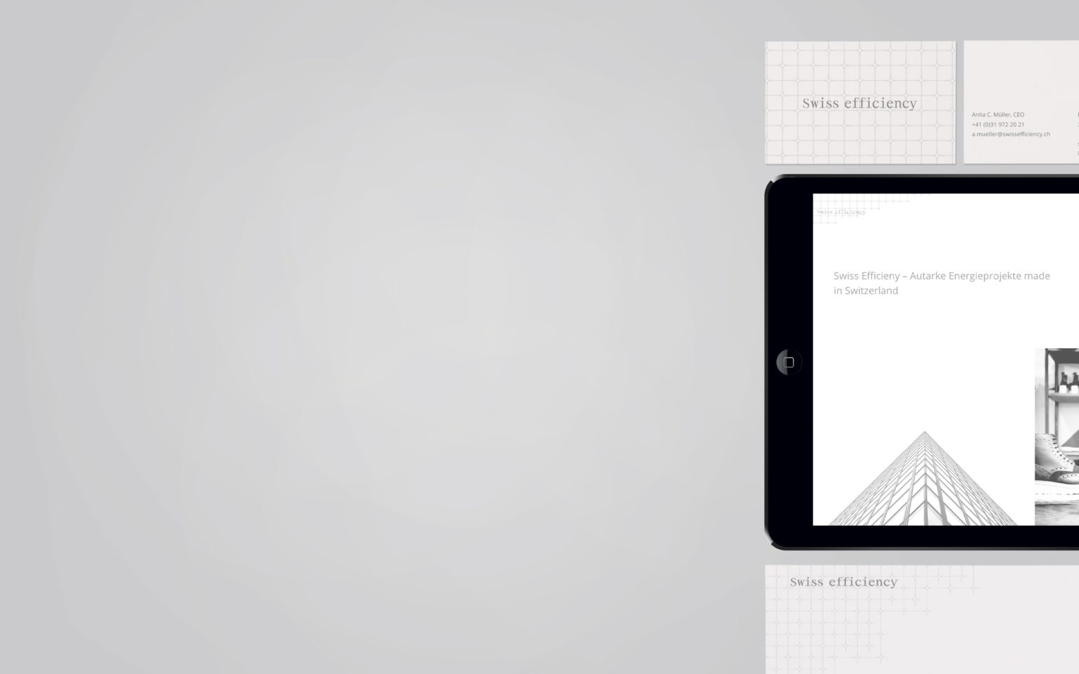
For the mother brand, Enigma created a complete visual identity from the business card to its website, showcasing all of the start-up projects incubated under it.


Impact
The different sister companies are in need of a strong island position and with that, individuality. At the same time, the technology used is identical for every product. For this reason, a brand architecture had to be found which focuses either on the product or on the or on the technology, depending on who the target group is.
This is why the product line is always complemented with the signature “Powered by Swiss Efficiency” and performs better because of the trust in the mother brand.