The Color Wheel: Use Color to be Unique
A child chooses a box of cookies on a supermarket shelf. Why this box rather than another one? What elements have stimulated the child’s brain in making this choice? A product such as a box of cookies belongs to two specific contexts: the family of products manufactured by the same brand (cakes, crackers, breads) and the competition of similar products (other cookie brands).
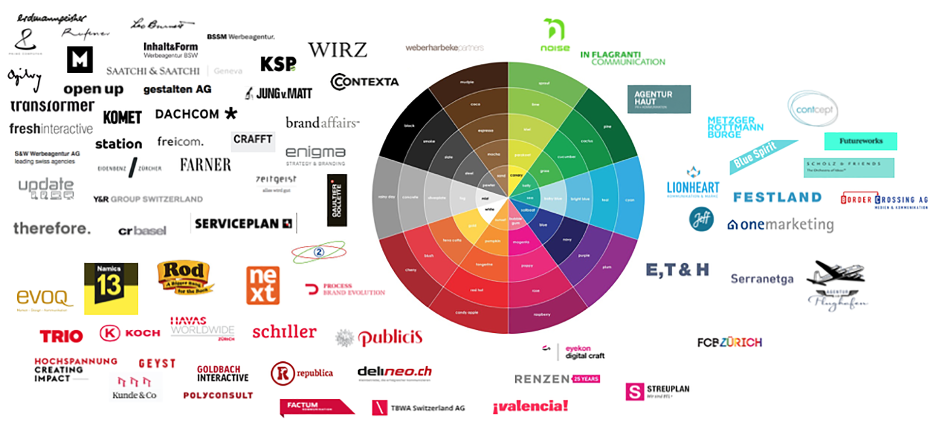
The logo wheel is a tool that helps the visual positioning of a new product in these two contexts. The wheel includes all colors from a painter’s palette. Before developing communications around a product, we collect all the logos from the two contexts in which the new product will be located: other products by the parent company and products from the competition. Once the logos are placed on the wheel according to their color, we analyze the color choice according to product type or the industry. Then we try to explain alignments and distancing, and we justify the color chosen for the new product according to the ways in which other brands are positioned. The new product can be aligned with the existing brands (a new line of organic products will pick green), distance itself from its context (see below), or try to set a trend.
Read: Everything you need to know about branding

Case Studies
Commercial airlines tend to have blue as a dominant color. Blue is a reassuring color, and blue is also the color of the sky. Airlines have to promote the safety of their aircrafts and transportation of passengers in the sky. In the 1990s, a new airline was born: it is called EasyJet and it tries to distinguish itself from its competitors on all possible counts: short flights within Europe, very low prices, ticket sales almost exclusively handled online, minimal on-board service. With so many differences, the new airline had to choose a logo that clashed with the competition. The choice of a bright orange is certainly not a random one!
Supermarket chains in Switzerland compete in a small market. The two giants, Coop and Migros, have embraced the same color–orange. Until 2009, Manor’s logo was located next to them. But it evolved by losing its red feature and adopting black. This visual transformation increases the distance with Coop and Migros–chains that are considered “popular”–and bring Manor closer to Globus, which reflects its strategy to reach an upscale market.
The logo wheel can be used in multiple ways: we have seen examples of logo positioning, but we can perform the same experiment with posters, pictures of shop windows, films, etc. We can organize objects according to their country of origin (for a product that targets an international market) or according to their tone (serious, ironic, metaphorical, etc.) The logo wheel helps organize objects that come from the same environment. It can be used with any kind of product, from food to politics to fashion and toys. The goal is to organize the logos following a consistent principle, analyze the clusters around the same colors, and position the new product strategically. It is also essential to test the new visual identity with various media and applications (packaging, posters, television, etc.).
Read: Get your fingers off these logos!