Create a Unique Brand with Type Design
Type design
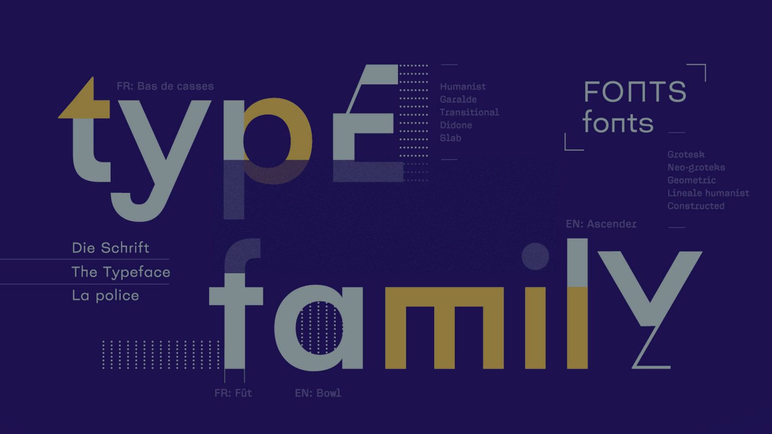
Type design is the ultimate design tool to set the brand visual tone in every aspect of the identity.
Type, font or typeface is a discipline that has shaped our cultures throughout History. Traditions and the evolution of reading brought letters carved in wood and lead to our modern digital tools. The advancement of technology helped us produce high-quality fonts in a sandbox without borders.
A unique look and feel for your brand content
Type design makes it possible to express the brand essence through specific shapes that set up a particular visual tone. This gives both the brand and the designer an unimaginably powerful tool. Our branding methodology, the Creative Footprint defines all the ingredient needed for the creation of a custom font or type family.
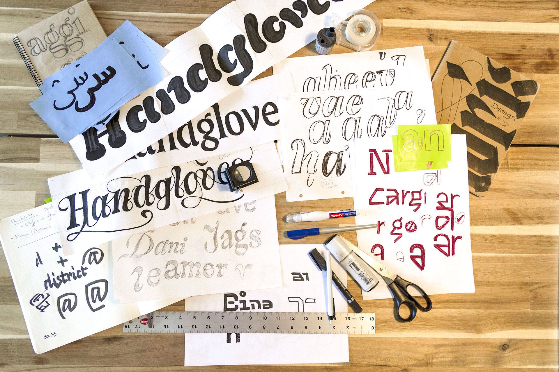
There are multiple approaches to start a type project for a brand. Whether the whole alphabet is the logical evolution of a logo or it’s the tone of reading for the brand’s content. Solutions go beyond a rigid structure.
A whole new world
However, to understand the approach of type design, it’s important to be very specific on different project possibilities:
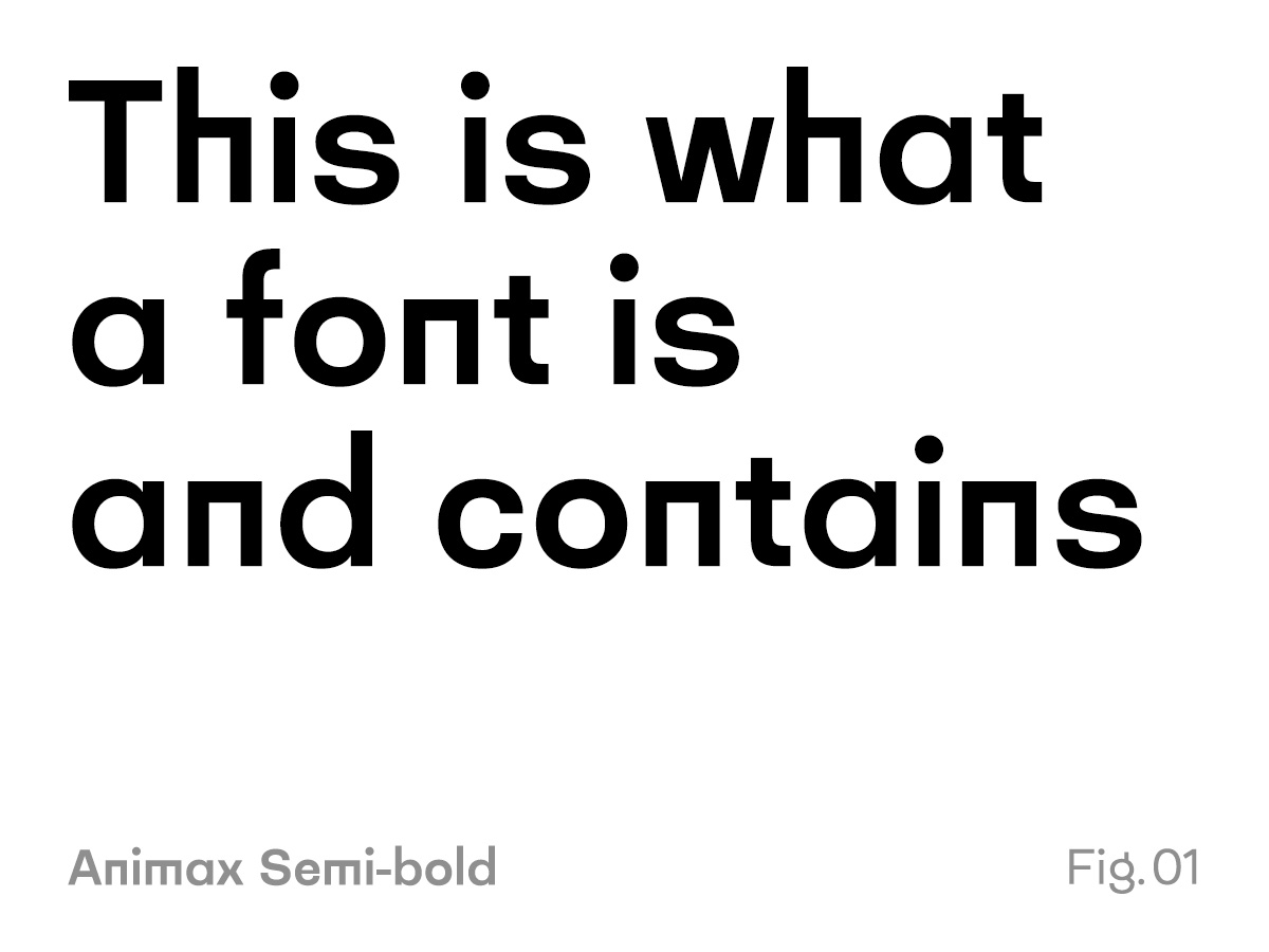
Fonts (fig. 01)
Fonts are commonly considered as a singular weight & style of a type family. A great example would be Arial Bold. It contains a certain amount of glyphs (letters, signs, diacritics,…).
Typeface or type family (fig. 02)
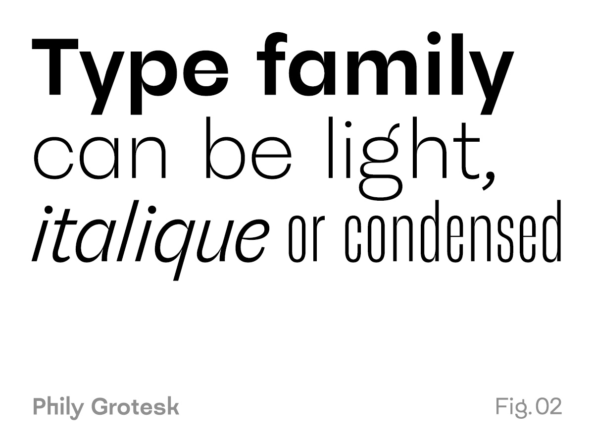
A typeface includes several weights and styles. Common weights are light, regular, medium, bold and black. A lot of these families feature an italic style for each hese weight. The very famous typeface Univers also includes a condensed style to the whole family. Some most commonly known example are Times New Roman, Arial, Georgia or Helvetica.
Weight (fig. 03)
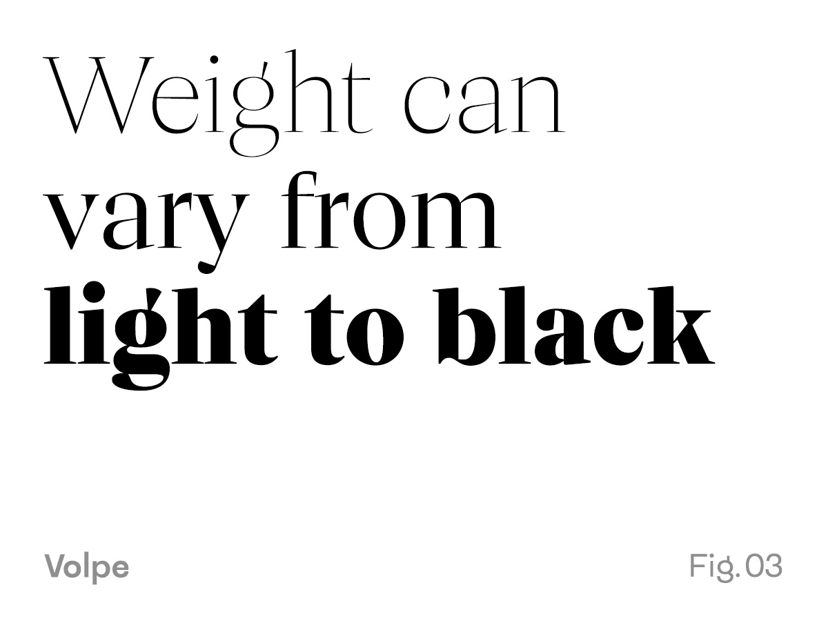
Weight is simply the different variation of thickness inside a typeface. This can vary from type family to another. Some super families have up to nine different weight from ultra thin to black. Weight really extends the various usage possibilities of a type project.
Style (fig. 04)
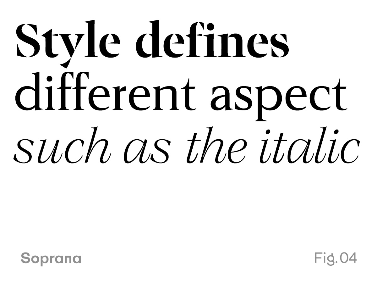
Style is a multi axis system that includes roman or italic, condensed or extended or even a stencil or normal style.
Width (fig. 05)
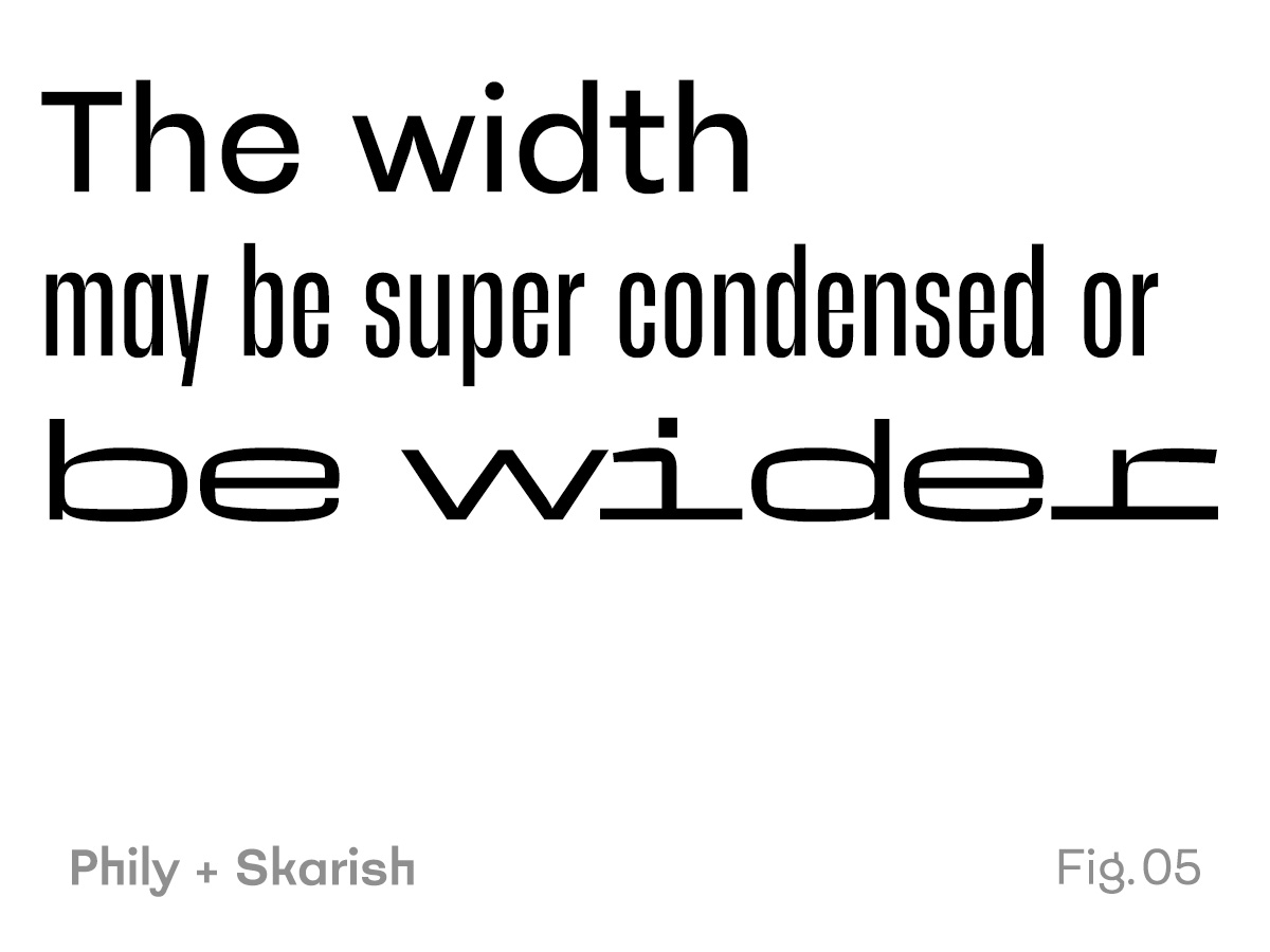
Width defines the compression or extension aspect of a typeface or font. It also works on an axis which defines just how extended or condensed an entire family can be.
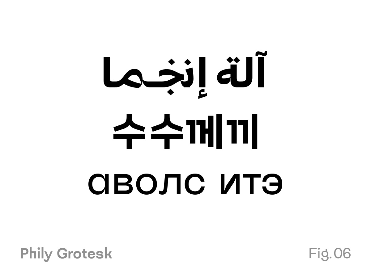
Languages (fig. 06)
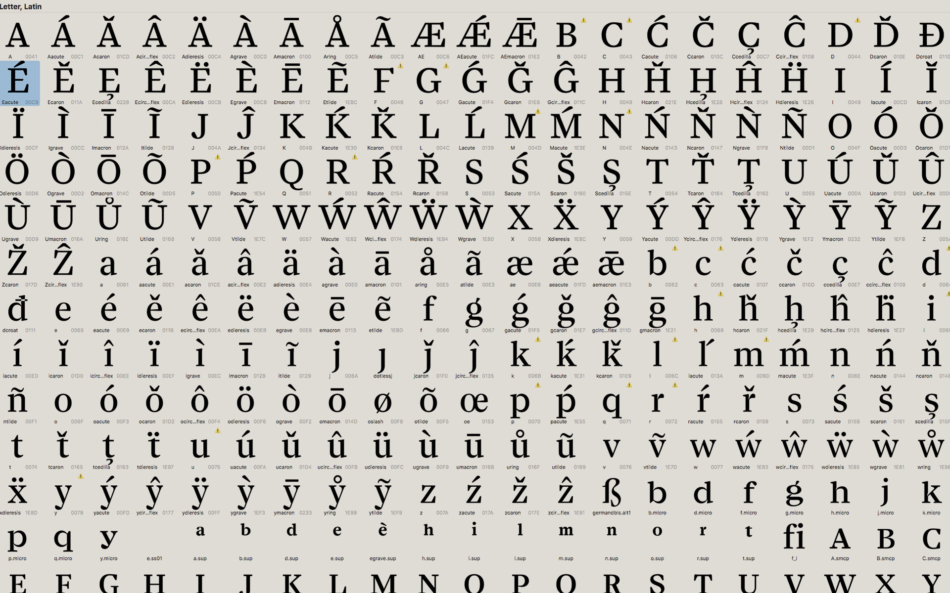
Languages other than our mother tongue might be intricate in different manners. Whether the script stays the same, for example, French compared to Icelandic, the consideration of the final user, the reader, is an inevitable phase of the process. Now imagine what kind of cultural consideration you should have when you need to make a typeface work with Latin, Arabic and Hangul (Korean). This phase of type design is the ultimate test to confirm that the visual language created by the project is understood and can be applied anywhere.
A new trend: blanding
While type design aims at uniqueness, blanding is the practice of standardizing your brand. You can read in our article about why brands more and more renounce to be distinctive.
How about you?
Have you ever wondered how you brand would look as a font? We should definitely talk about it.