Re-branding international real estate visionaries
ICN is a real estate developer in Belgium and Luxembourg. Its philosophy of placing real estate projects in a holistic and socially relevant perspective makes this company unique. Living and working environments should serve people and not represent emotionless spaces that want to be revitalized. This corporate philosophy, driven by curiosity, allows ICN to find, plan and realize unique projects time and again. ICN develops sustainable value and thereby differentiates itself from the industry.
Ambition
The company evolved from a modest real estate firm to a considerate organization that shapes the way people live and work together and has great visions for the future. This required the creation of a branding that reflects the difference to the industry and gives the company an unmistakable personality.


Action
Using Enigma’s Creative Footprint method, the multifaceted dimensions of the brand were developed together with the Leadership Team and ICN employees in workshops and intensive collaboration. The Golden Circle – the Why? How? and What? – from which the value proposition is derived, the neuromarketing dimensions, a coherent storytelling and finally the brand personality itself were derived and coordinated. The result is an unmistakable brand profile.
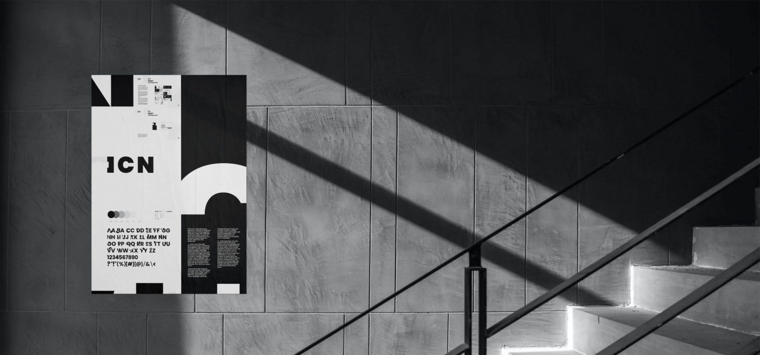
Why unmistakable? The designers reached their limits when they tried to create the ICN brand universe with existing fonts. That’s why Enigma proposed the development of a distinctive but intricate font that gives the brand a distinctive identity and also has a high recognition value. The font is named “Clementine” after its designer, Clément. The design leaves it open whether the visual universe or the font inspired by the company’s activities was created first.
The visual elements of the brand identity reflect creative, architectural work as well as the construction of an entire real estate project that shapes its environment. The result is a branding that can be summarized in one sentence: “ICN is the artist’s signature and thus the quality label by which one recognizes that a project is carried out by ICN” and is expressed in the value proposition as follows: “The art of real estate development. ICN. Every project is a masterpiece.”
The font “Clementine”


Impact
Over the 9 months of the process, the brand didn’t only “mature” but it also gained self-confidence. It reflects the vision of the future, in which real estate and its use must be rethought and staged.