Window to a new visual identity
The Salvation Army wanted to change their marketing concept from a global strategy to a strategy based on local communities and associations. Therefore, Enigma made it a priority to develop a visual identity corresponding to this new organizational strategy.
Ambition
Create a new visual identity for the Salvation Army that would allow associations to communicate individually while maintaining a graphic line common to the entire organization. The Salvation Army wanted to develop a timeless and attractive identity without revolutionizing the existing codes and symbols.
Every element of the new corporate identity had to be easy to use by every team – whether they are professional designers or not – and it had to be possible to print them on ordinary desktop printers without the possibility to print freeboard.
Action
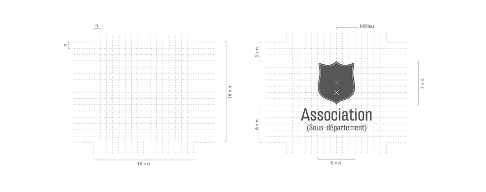
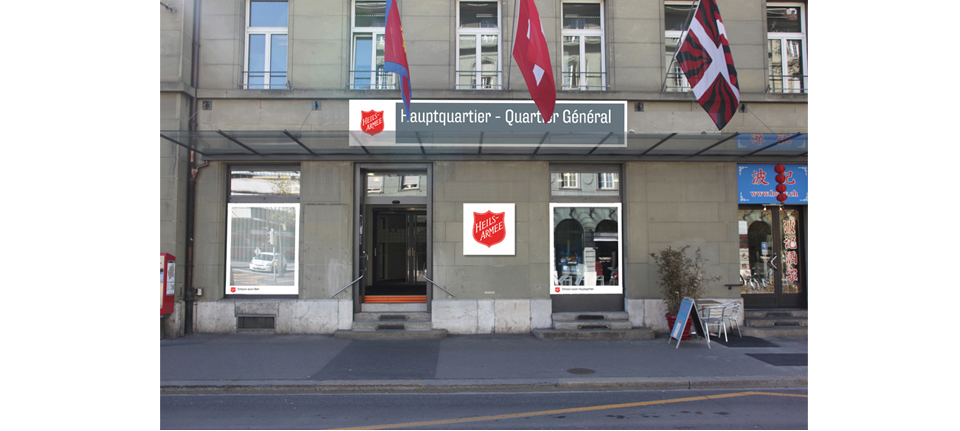
Visual identity concept: The visual system developed for the Salvation Army is based on the “window” concept: a block present on every communication item. This window represents a space in which every organization of the Salvation Army can show their commitment by using images, texts, or just color blocks.
This new visual identity allows on a hand to keep a corporate branding that is common to the whole organization, and on the other hand to give institutions, projects and initiatives the freedom to have an individual and personalized identity.
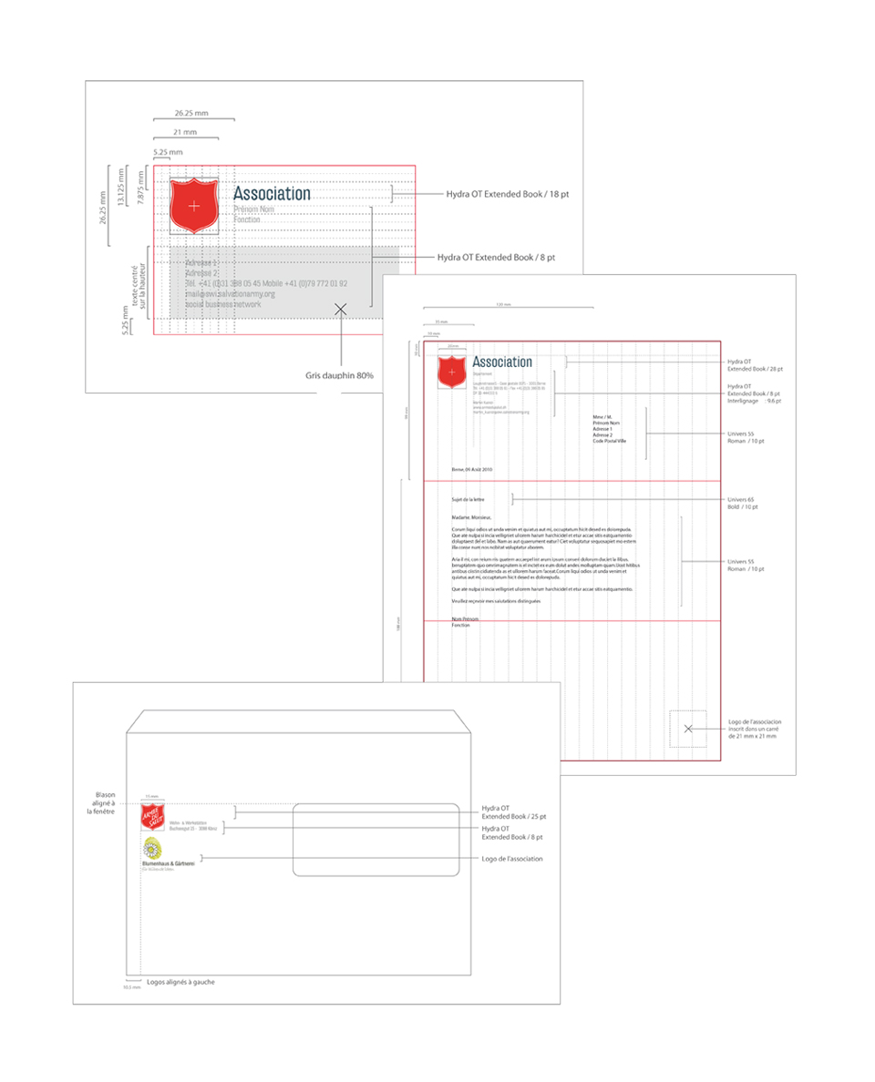
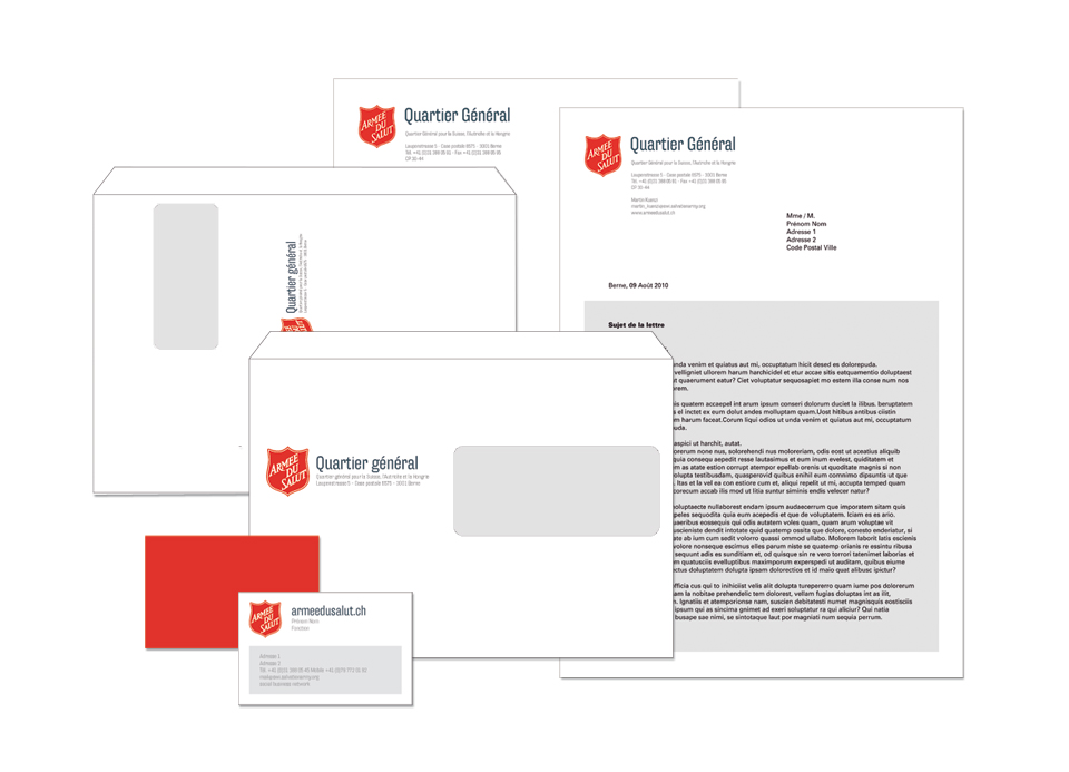
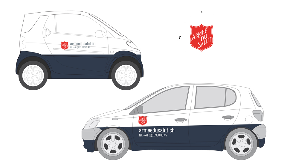
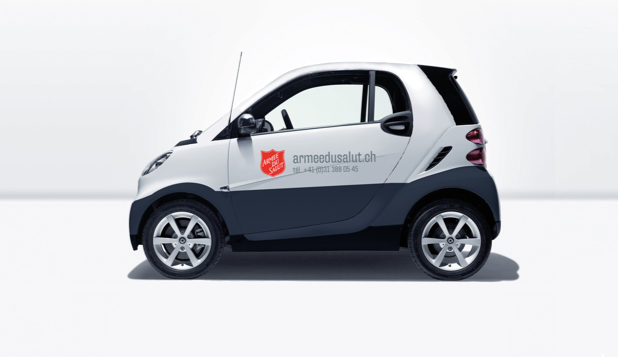
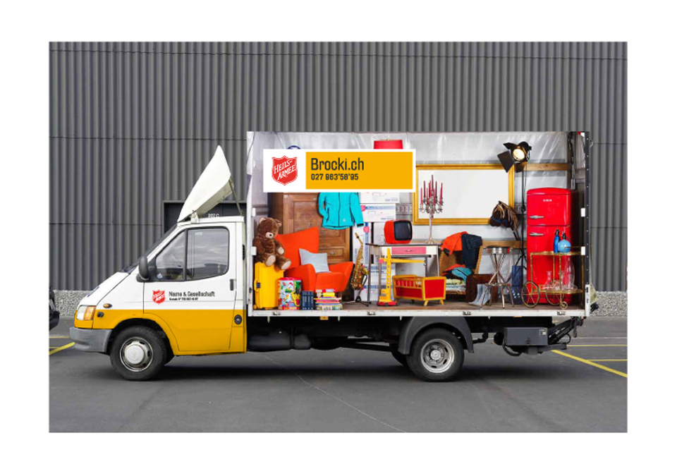
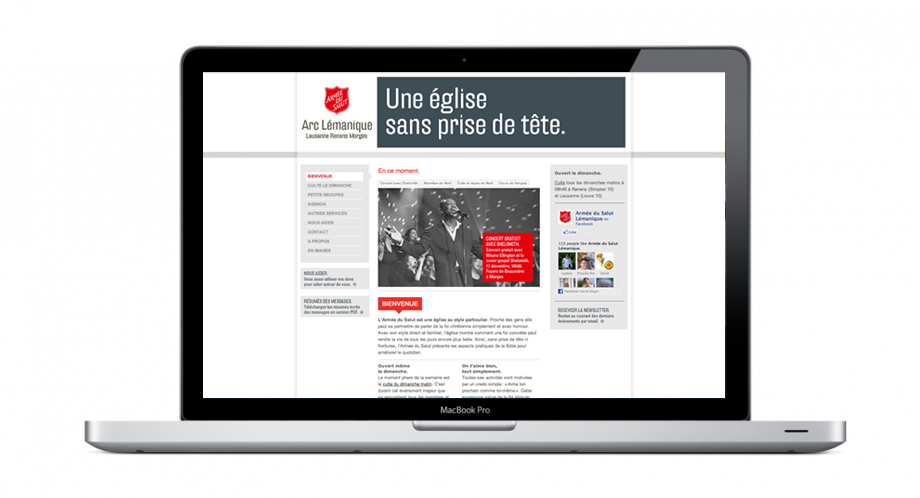
Templates and implementation: Once the concept was defined, templates were created for different communication tools such as stationery, ads, flyers, brochures, websites, and even vehicles. These templates were put at the Salvation Army’s team’s disposal through their intranet.
